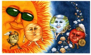
“They’re solid. They’re rocky. They’re close to the sun. Here come the inner planets.”
So now the competition really gets underway, with the 4 planets closest to the Sun making their group debut. This particular page probably has the least amount of Who & What background explanation, but that doesn’t mean i skimped on the thought or research process. Even as simple as it looks, i still managed to stick in a little subliminal information, specifically in terms of the Asteroid Belt.
The Inner Planets are the rock-based ones. Not only closest to the Sun (which, naturally takes up the bulk of the spread. I must confess, i am particularly fond of the sunglasses) but also located inside the Asteroid Belt so, of course, the asteroids needed to be featured. And since they were in the illustration and had to be colored, i decided i would render them based on their unique chemical/physical composition.
I should note – in reality (in Space) i doubt that you would actually see any color distinction, and even if you did it probably wouldn’t be as obvious as i made it, but it was important to convey that all asteroids are not the same. In fact, there are three different types and each are made up of different materials/substances so i attempted to communicate that information through color.
The 3 types of Asteroids are: M-Type, S-Type, and C-Type.
M-Type is made up of nickel and iron, so i colored those asteroids in silver and grey.
S-Type is made up of a rocky material, so those are colored in reddish brown.
C-Type is made up of carbon, so those are represented in black.
It’s a small thing – but it was the kind of artistic choice i found myself constantly aware of when doing the illustrations for this book. My goal was to find fun and interesting ways of sharing all the cool and fascinating things i had learned through my research. Creating all the little touches that i hoped (hope) ignited some curiosity.
If only one child asked, “Why did the illustrator color those rocks like that?” this picture was a success!
