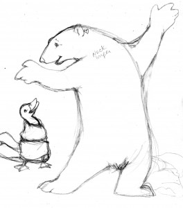
The pencil rough process is the longest (at least in terms of describing it) as evidenced by the chapter continuation of the previous chapter continuation, but let’s face it… it’s kind of a good metaphor for life, or evolution. Each pencil scribble builds on the past, getting more complex, fixing the parts that don’t work, tweaking the parts that have potential. Building a character that will, eventually, become the fully realized personality in the picture. ‘Til then there’s just a lot of scribblin’ goin’ on. I’d have to go back and scour my journals to actually see how much time was spent on the process of creating the main animal characters, but i generally block off a space of “free time” between other projects and just hole up in the art room until such time as i’ve either finished what i wanted to accomplish, another deadline takes me away, or my head explodes. In the case of “Fur & Feathers” (or F&F as i generally refer to it in my notes) along with the human character of Sophia i also had to create seven featured animals: a polar bear, a duck, a porcupine, a frog, a fish, a snake, a snail and a ladybug. The polar bear was first.
I have a special fondness for polar bears. One of my first (well, technically my 3rd) major mural projects was painting a life-size polar bear on a wall, followed by a faux den and polar scene with life-size female p’bear and cub, so i already came to the F&F project with a bit of Arctic bear experience. The fun of this variation was – i could be a lot more whimsical. I mean, the bear starts out naked after all (if you’ve been reading along the whole “naked animal” issue was discussed previously), so i could take all those natural/realistic references and mix them up a bit.
Here, i guess, is a logical place to discuss the nature of illustrator-ly “style”. At least what i know of it. Artists tend to have a particular “look” or “style” (or “tell”, if you’re familiar with gambling parlance) – that you just recognize when you see their work, no matter what the context. Van Gogh from Matisse. Rockwell from Escher. Trina Schart Hyman from Brian Froud. [Okay, i’ll admit i often get James Montgomery Flagg and Howard Chandler Christy confused, but that’s just me]. While i in no way mean to imply i rank with those artists, my style is what it is… my own particular way of drawing things. I occasionally attempt different techniques but, by and large, i can’t help but gravitate back to the semi-realistic, partly-cartoony look i’ve been doing forever. F&F, however, allowed me the opportunity to dip into something a little bit more fanciful – meaning, that however “realistic” and natural the animals in the story were going to be, i had the leeway to be a bit looser and more carefree with them.
Of course i need to stress “looser” is a relative term here. I probably couldn’t really get very “loose” with my stuff even if my life depended on it (believe me, i’ve tried). I’ll start out all broad and free-form and next thing you know i’m hunched over again with my tried-and-true, tight-fisted approach. The point of all that being – a different artist would have approached this story in a completely different way, not “better” just different, and it’s kind of fun to imagine how someone else might have rendered it (that would make for an interesting book all by itself come to think of it). But i’ve gone off on a tangent again – and i still have seven more animals to introduce. Like the duck.
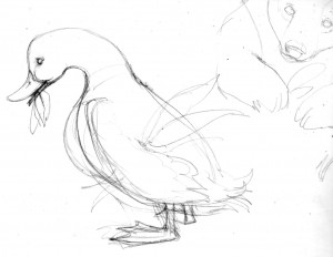
While there is only one kind of polar bear – no matter how you choose to draw one – there are many, many, many, many different types of ducks (and i should know, because i’ve been called upon to draw a fair number of them for ID plaques) and Janet didn’t really specify what kind of duck she had in mind. Here is where the artist gets to use that “artistic license” you’ve heard so much about. Given the narrative i really could have picked any one of a number of species: Common Shelduck, African Pygmy Goose, Wood Duck, Northern Pintail, Pink-Eared Duck, King Eider, Harlequin Duck, Common Goldeneye, Common Merganser, or Smew. So long as it had a white band somewhere on its neck (per the manuscript) i could have opted to use anything. But, i felt the needs of the story were better served by going with a Mallard. A good basic workhorse of a duck (to mix a metaphor) that the average aged reader of the story would instantly know. An icon D-U-C-K of a duck. There was already enough crazy stuff going on in the story – what with the naked animals and Sofia re-dressing them all – without introducing unnecessary character complications. The porcupine, however, proved to be a bit more problematic.
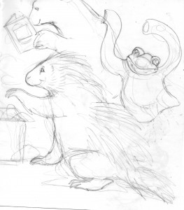
There are a couple different varieties of porcupine but choosing which one to use wasn’t the problem. My difficulty actually came from a probably far too literal reading of the manuscript. In the story, if i haven’t explained this yet, all the animals lose their various fur/feather coverings in a wind storm-induced dream and the little girl, Sophia, re-covers them with the ingenious and creative use of the contents from her grandmother’s sewing basket. In the porcupine’s case, Sophia chooses pins and needles which are quite clever except – in my mind – they’re too short. Porcupines have long quills, and lots of long coarse hair, and i really couldn’t figure out how i was going to make short little pins fill that need. Interestingly enough, i went ahead with the pencil roughs on these pages without really having the answer or how i would portray it. I put a basic “generic porcupine” in as a place -holder, and postponed figuring out the actual look of this character until later so i could move on to – the frog.
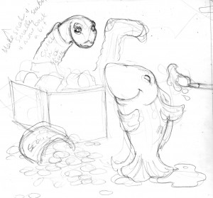
As the rough sketches may demonstrate, i like putting visual clues in my children’s book illustrations. Hinting at things to come or enhancing what has already been seen. For F&F i wanted to show the animal first in it’s naked/dressed-in-Sophia’s-clothes guise and then show it re-dressed in it’s new animal skin, and while one animal is revealing its new covering the next animal in need of help is visible in the background. In this case, the “newly fixed” porcupine is picking out its decorative needles (i was still struggling with that) while the next animal, the frog, hops around -hopefully humorously – in Sophia’s sweater. I decided on a bullfrog because it has interesting skin patterns, but also because it was different from the leopard frog i drew in my previous book (sometimes it just comes down to simply not wanting to copy yourself).
Note on the clothes: I tried to pick clothes or accessories that were wildly inappropriate for the animal’s life style. As if any clothes at all weren’t inappropriate enough.
A fish followed the frog and just as there are hundreds of different kinds of ducks there are even more variations of fish, and while this particular fish was obviously going to be quite silly and cartoony (wandering around out of the water) i still wanted it based in some sort of reality. In the story Sophia gives the fish new scales of rainbow sequins so i hunted through my fish books and found the perfect, colorful specimen, a Flagfish (a small, deep-bodied pupfish that can survive extreme environmental conditions. If being scaleless and breathing out-of-water doesn’t classify as an “extreme environmental condition” i don’t know what does. Besides, they’re pretty).
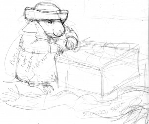
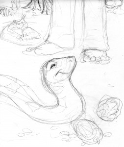
The next animal in need of Sophia’s help was a snake, wearing a knee sock until she could fashion new scales for him out of pine cones. Throughout the story, Sophia gives each animal her own special personal touch – a heart behind the polar bear’s ear, a blue ribbon around the duck’s neck, a decorative hat pin for the porcupine, slime for the frog, and rainbow sequins for the fish. In the snake’s case she added yellow bows. From the start i chose to keep all of Sophia’s couturial creations as natural-looking as possible; i didn’t want the snake wrapped in real ribbons, for example, i wanted the yellow “bows” to be more like markings. So i had to find a brown snake with a yellow pattern that looked like bows. I also didn’t want it to be poisonous, not that anyone would necessarily know, and i eventually found my reptile in the form of an Eastern Hognose snake that has a very nice blotchy bow-esque yellow pattern running down its back and is variable in color – having a brown phase. Also, in the rough sketch behind the snake, dressed in a slipper until Sophia could find him a new shell, is the snail.
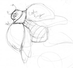
Which brings us finally to the last, featured, animal – the Ladybug who, being the tiniest character in the book, needed the biggest close-up (Mr. De Mille. Who didn’t see that coming). In most cases, while i may have done a few separate study sketches of the different animals, most of their look and personality was actually established during the process of roughing out each full page of the book. Enlarging the thumbnails up to full size helped the animal characters evolve and in several cases the picture itself changed from the original concept… but that’s another entry.
So fascinating, Laurie. Thanks for sharing!
Great publish! I 100 % agree with you.
After looking into a number of the blog articles on your website, I honestly like
your technique of blogging. I added it to my bookmark website list and will be checking back
soon. Please visit my website as well and tell me what you think.
Very excellent post, thank you a lot for sharing. Do you have an RSS feed I can subscribe to?
Thank you for your kind words. I’ve been away from the blog for awhile – but i’m going to try and get back into it. As for an RSS – you’re talking to a dinosaur here. This is as technologically advanced as i can be.
Thank you so much. I go into writing spurts – depending on whim and muse. I’ve been feeling guilty that i haven’t written in such a long time – but i’m going to try and get better! Thanks for the encouragement.