Fur & Feathers: Chapter 3 – How Do I Make Naked Animals Cute?

January 23rd, 2010

The beauty of words and drawing is – anything is possible.  You are not constrained by the Laws of Nature or the Rules of Reality.  You aren’t really constrained by much of anything except, perhaps, the limits of your own imagination (and possibly skill sets)… but even then there’s no hard and fast boundaries.  You can have characters do or be anything  without fear of anyone saying “But that’s not possible”.  Nonetheless, there are certain conventions unique to specific genres that one tends to try to follow –  making the subject look reasonably natural and realistic if that is what the story entails or the publisher requires, for example.  “Fur & Feathers”, however, was not one of those kinds of stories so i was free to let my imagination run as wild as i liked, and i could loosen up a bit on the heretofore (isn’t that a great word, by the way, not used nearly enough.  Ranks up there with notwithstanding as an all-time great singular word made up of a bunch of smaller individual words all mashed together) more naturalistic style i’d been using for my previous children’s books (“If A Dolphin Were A Fish”, “Little Skink’s Tail” and “Where Should Turtle Be?”).

I’m not really sure how to characterize my actual style.  It’s kind of a blend of cartoony and realistic, strongly influenced by years of watching Disney animated films and my deep passion for children’s books and their illustrators.  For the previous books i gravitated more to the “realistic” end of my personal style spectrum (well, assuming you can call a dolphin-pelican morphed hybrid “realistic”) because that was what the stories required, but for “Fur & Feathers” i was able to explore the more playful, fanciful side of my repertoire.  It all takes place in a kind of dream place – so reality was not that crucial.  That’s not to say that made the job any easier however.  Right off the bat, in fact, i faced a difficult artistic problem, one i circled for days as i read the manuscript and jotted down notes.  Specifically – fanciful or not – how to make naked animals look cute!

I guess i’d better give a little story synopsis, huh?  Okay – the book opens with a wind storm raging outside a little girl’s bedroom.   The howling wind wakes Sophia (our heroine) and her mother suggests they count animals until she can fall back to sleep.  In her dreams, however, the animals get all swooshed up in the wind storm, spinning faster and faster until “the wind blows them right out of their coats” and they are left standing in Sophia’s room shivering “in their bare skin“.

Sounds cute, doesn’t it?  The operative word here being sounds.  Now picture the reality…  take your time i’ll wait.  Do images of naked mole rats, plucked chickens, Chinese crested dogs, and those weird cats without hair come to mind?  Do any of those things actually look cute?  (well, obviously to some folks they do, and no offense to naked mole rat lovers and Chinese crested dog and hairless cat fanciers intended).  Heck, even sheared sheep and shaved alpacas look a little… peculiar (and not necessarily in a fun way, tho i suppose the argument a could be made that they are at least funny looking).  Anyway, now try and figure out how to draw that – for a children’s book – without creeping the reader out.  Not to mention there is a whole other problem you probably have never thought of (having little opportunity to imagine naked fauna) –  without distinctive markings, color patterns, fur, hair, or feathers a number of animals don’t really look like much.  Or at the very least they all look surprisingly alike.  Think about it: line up a jaguar, a leopard and a tiger and strip off all of their fur, now you have three large cats that could all be pumas or panthers or  lions (sans mane).  The point is – without fur, feathers, distinctive coloration, markings or patterns you don’t have a lot to work with by way of distinguishing one animal from another, and all birds simply wind up looking like varying sizes of frozen poultry (and i don’t care who you are – plucked birds have got to be the ugliest things on the planet.  Well… besides hag fish).

The whole story is about Sophia attempting to clothe all these naked animals, first with outfits from her own closet and then later by fashioning their real coverings, or a reasonable facsimile, (thus the Fur and Feathers of the title) from things found in her grandmothers sewing box.  It’s all really very clever how she does it but this is where words have a bit of an edge over the visual arts in that words don’t have to show you how it’s done or what these poor exposed creatures look like in the interim.  That task fell to me.  So the first order of business was figuring out how to convey nude creatures in a fun, uncreepy way, and also have the young child reader/listener be able to figure out what the different animals were without benefit of their normal distinguishing characteristic externals.

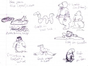
I was pretty safe for the first two pages because the opening illustration shows Sophia and her mom in Sophia’s room – so there were no animals, naked or otherwise, to contend with.  And the second page was the wind/animal/dream vortex so i could just show bits and pieces of various animals all still mostly covered in their regular fur/feathers or hidden by storm debris.  It was after page 2 that the difficulty (and the fun challenge i hasten to add) began because that was when all these bare animals showed up and Sophia’s adventures started in earnest, beginning with pulling all her clothes out to cover them.  It was the clothes that finally solved my problem.  By putting the animals in various human outfits i eliminated the need to show any of them completely naked.

The Featured Naked Animals In Children's Clothes

The Featured Naked Animals In Children's Clothes

Eight specific animals are featured in the story, and these guys would be in “costume” until covered by their new “natural” Sophia-made dressing of fur or feathers or scales or slime thus no longer posing an esthetic problem.  For me.  I’ll happily concede i probably spent way more time worry about that detail then was absolutely necessary – but such is my process.  Obsessive is another description that comes to mind.  As does Compulsive. Or  Anal.  I’ll cop to them all.  And my overly-analytical micro-management  concerns about making naked animals look appealing (and identifiable) did not completely end with the addition of clothing.  I was faced with one more dilemma – what to do about the Polar Bear?

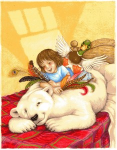
A polar bear is the very first animal Sophia “fixes” (for lack of a better word) and here is where the realistic side of my art style came into play, as well as 11 years working for SeaWorld – one major project being a back stage mural of a polar bear habitat.  My SeaWorld stuff, by it’s nature, has to be more realistic and i take a lot of pride in researching whatever i’m called upon to paint, sketch or draw so that it is correct.  And one of the biggest things i learned during my polar bear mural experience is – Polar Bears have black skin! (NOTE: another little FYI tid-bit: their fur is technically clear.  Think of it like a sheet of plastic wrap – it’s transparent until you ball it up, then it become opaque, and looks white.  That’s how P Bear fur works – the fur is actually transparent so the Sun’s rays can penetrate to the black skin beneath – thus keeping the bear warm.  Pretty cool, huh?  No pun intended).

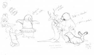
So now i was faced with a naked polar bear that would technically be black with all it’s fur removed, so that it now looks like a black bear (at least as far as a children’s illustration is concerned.  Obviously, in real life, a polar bear looks nothing like a black bear – they have completely different body shapes), which i feared would confuse both a child and an adult reader.  Of course nothing in the manuscript said i had to show the polar bear prior to receiving his new coat (and why Sophia’s grandmother has fur in her sewing basket will be discussed in a future installment) but i like the continuity of linking story elements together, and giving little visual hints and clues of what is to come in the illustrations, so i really felt it was important to show the p bear going thru the entire make-over process.  Again it was the clothing that came to my rescue and if you look at the upper right corner of the thumbnail sketch above (or the pencil rough below) you’ll see how i solved the problem.  I put the p bear in a hoodie and then simply covered as much of him up as i could.

Rough Thumbnail for Page 3 - Sophia Dressing the Animals

Rough Thumbnail for Page 3 - Sophia Dressing the Animals

With that problem solved, and an idea of how i would handle the other featured animals as they each appeared in the story, i was able to start brainstorming the actual rough sketches.  Page 3 is where Sophia dresses the animals in her clothes and i wanted to show a variety of animals in a number of very silly and inappropriate (for an animal anyway) outfits.  The polar bear was the only “featured” animal i wanted on the page so i had to come up with some new ones.  Which, as i explained earlier, isn’t as simple as it sounds because these animals had to be easy to identify without their usual markings (when done in color they’d all be grey or pink after all, or black in the p bear’s case) as well as partially covered up with clothing.  A sea lion, deer (later changed to a big horn sheep), komodo dragon (because there is a display of them near-by at the St. Augustine Alligator Farm), and penguin fit the bill perfectly.  And then i thought of the sea otter…

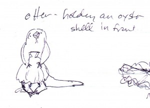
Naked Sea Otter w/ Clam Shell

Naked Sea Otter w/ Clam Shell

… my personal favorite i must admit.  Proving, i suppose, that naked animals really CAN be cute after all!

Now it was time to start doing the rough sketches (aka:  To be continued…..).
Tasha & Taliesin: In the Company of King Arthur’s Bard

January 16th, 2010

So… many, many, many years ago, when i was about 8 or 9  (after my family moved to Florida) we finally got our first dog.  My brother and i had our hearts set on a Manchester Toy Terrier (or at least i did) having seen one owned by a friend of my grandmother, but of course that breed was a bit obscure so not readily available at the place my parents took us.  I don’t recall the details of what spurred the decision to get a dog that particular afternoon, or why my dad chose that specific place (in my memory it was just some pens by the side of the road, but i could be way off).   The whys and wherefores are really rather immaterial now, what is important is – we found a Welsh Corgi.

I can’t say enough wonderful things about the breed now, but at the time we knew nothing about them.  All i know is – there was this animated, adorable, sweet puppy in a litle cage and she just won our hearts.  All thoughts of the “must have” terrier vanished in the presence of her winning smile and personality (and yes – corgis DO smile). In retrospect – now that i’m an adult and have several years of “mom” experience and pets under my belt – i suspect it was my mother who actually chose her, but the decision was unanimous and Tiefy became our family dog and started an obsession with the breed that has lasted a lifetime.

And all of this is a rather long preamble to explain why Welsh Corgis (specifically Pembroke Welsh Corgis) have been a long, and cherished inspiration.  Tiefy was my first introduction to the breed, later – when our daughter was about three years old – Tasha became my second.  We had Tasha (named for the wonderful children’s book illustrator who featured them, Tasha Tudor) for 14 years, and the year she died i dedicated this Christmas card to her.  Since she was mentioned briefly in 2009’s “Auld Lang Syne” card i have been eager to share her own special illustration story.

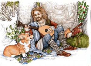
Tasha & Taliesin

Tasha & Taliesin

2007

Fourteen years ago, Tasha appeared at Christmas time and proceeded to weave her own unique magic through our lives.  This Christmas there was never any doubt or question that my annual 2007 holiday greeting would celebrate our little corgi’s wonderful life and memory.  Of course, me being me, i couldn’t just leave it at that and simply draw a picture of her.  Instead, in typical Laurie Christmas Card tradition, there is a convoluted story behind the illustration’s ultimate incarnation.  For one thing, i have long wanted to use the Welsh bard, Taliesin (c. 534 – c. 599), in a card (you know my obsession with knights and troubadours). Considered the greatest of the Welsh poets, he is believed to have been a bard to at least three British kings of the era and his name is associated with “The Book of Taliesin“, a collection of poems that was written down in the Middle Ages and is one of the “Four Ancient Books of Wales“.  According to Celtic mythology however, Taliesin was also a wizard and shaman, and the first person to acquire the skill of prophesy through the strange and supernatural circumstances of his birth and multiple incarnations.  Legend further says he attained the status of Chief Bard of Britain in King Arthur’s court.

What better companion for a Welsh dog of equally fanciful and enchanted origins.  In legend, the faeries and elves of Wales used corgis to pull their carriages, work their wee cattle, and serve as steeds for their faerie warriors.  To this day, in fact, corgis continue to carry the mark of the faerie saddle across their shoulders.  In modern times, it is theorized that Pembroke Welsh Corgis are descended from the Swedish Valhund, possibly introduced to Wales by the Vikings, so there is a wealth of magic and adventure in Tasha’s heritage as well.

Independent and sweet tempered, with beautiful bright eyes and a happy smile, i picture Tasha now in the land of her ancestors ~ inspiring sages, delighting troubadours, compelling wizards, and encouraging kings in the company of King Arthur’s Bard.

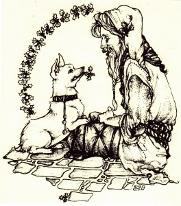
~ Twenty seven years ago (give or take) my fourth Christmas card depicted a Welsh corgi (Tiefy) with a “young” Medieval Santa.  That original design was the basic inspiration for the 2007 card – but with more flourishes.

Tiefy & Young Santa

Tiefy & Young Santa

The New Flourishes:

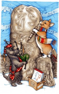
STANDING STONES ~  Dating back to Neolithic times, their precise date and function remains uncertain, but their connection to the Celts is legendary and not a little magical.  [NOTE:  See “Auld Lang Syne” illus. 2009]

THE ALPHABETS: “Futhark” ~ The message on the stone to the left is written in the Viking Runic alphabet called Futhark.  Most inscriptions in stone were in normal runes while another version of the alphabet was used for everyday messages on wood or bone.  I combined both alphabet variations for this message and while i realize it might be hard to decipher the sentiment without the full code i bet you can still figure it out.

“Ogham” ~ Running along the edges of the center and right stone are a series of notches and grooves depicting the earliest Celtic alphabet called Ogham.  Dating from the 4th and 5th centuries it was believed to be the magic writing of the Druids.  In this case there isn’t any real message, i just wanted to show an example of the script.

TORC ~ Decorative neck ring indicating high rank and status, closely associated with Celtic deities.

IN THE SACK ~  The “Book of Taliesin”, a bodhran, recorder, and skin of mulled wine (the traditional tools of the bard).

THE ANIMALS ~ “Dog” – well that’s obvious.  But also associated with healing.   “Salmon” – a source of knowledge.  One of Talieson’s incarnations was a salmon, represented here by the tail fin-shaped head of the lute.  “White Stag” – represents the eternal cycle of nature manifested in the seasonal shedding and regrowth of antlers.  Oh yeah, and in this case also Santa’s reindeer.

THE PLANTS ~ The Holly and Ivy are probably pretty obvious given the carol, but they were also sacred to the Celts for magical healing qualities, as was the Mistletoe.

TALIESIN ~ Was loosely based on the statue of the Celtic general, Vercingetorix (by Aime’ Millet 1819-91) because, in all honesty, i thought he looked cute .

Fur & Feathers: Behind the Book – Chapter 2, It Starts With the Manuscript

January 8th, 2010

Well, technically, i guess it really starts with the publisher contacting you to see if you’d like to illustrate another book… then after much clamor and excitement and  jumping up and down and e-mailing back “YES!”  in big bold letters you sit back and wait for the manuscript to be forwarded.  For me this all happened in the Spring of 2009 (April 2 to be exact) when i got the initial e-mail asking if i’d be interested in illustrating “Fur and Feathers” and noting all the business and deadline particulars, but i must admit i was chewing my nails for those first couple months of the year waiting to hear if i’d have a new title to do.

I can’t speak for all artists but i am very insecure when it comes to work and always fear every finished project will be my last.  “Where Should Turtle Be?” had just come out mid-February or so, and Sylvan Dell was busy getting their other Spring titles on the shelves, so i didn’t want to nag them about whether they had a new book for me to illustrate – but i was eager to start on a new illustration project.  I attempted to be calm and philosophical while i waited, figuring if SD didn’t have anything for me this time around i could take the lull and work on one of my own personal book projects (i have notebooks full of plot ideas and character descriptions and snippets of dialogue, so have plenty to keep me busy if  i could ever get serious about finishing something) but then i got the notice about the new book so immediately put all my own things back on the shelf.  I’m not giving up on writing and illustrating one of my own stories one day, but i’m content to wait until the Creative Writing Muse can give me her full attention.  And basically, i just work better when i have a firm deadline (otherwise i tend to be like Dug, the dog in “Up”, easily distracted by…. “Squirrel!“).

So… where was i?  Oh yes, The Manuscript.  “Fur and Feathers” was written by the very talented Janet Halfmann, author of many children’s books as well as my 2nd children’s book for Sylvan Dell, “Little Skink’s Tail”.  “Skink” was a fun book to illustrate, and seems to go over particularly well at school talks, so i was excited about working with Janet again.  Tho i think i should clarify what i mean by work with her.   I actually don’t work with her directly at all, all my correspondence and art direction comes from Sylvan Dell.  I don’t know how other publishers work, but i suspect it is all pretty similar – an author writes a story and submits it and then waits until, several months down the road, they finally get to see what a complete stranger did with their words.   I suspect it can be a little scary.  It would be fascinating to get Janet’s perspective on the process because i really don’t know what it must be like to write something and send it off and not see the story that you slaved over again until someone else has visually interpreted it.  Obviously there needs to be a great deal of trust between the author and her publisher, and the publisher and their artists, and i can assure Janet (and any/all authors whose books i’ve had the pleasure and privilege to illustrate)  i treat every one with the utmost respect and care.  And F&F was a particularly fun and challenging story to work on.

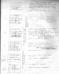
The manuscript was e-mailed, with the story already separated by page (what words were to go where), and being a children’s picture book that meant every full-page spread counted as one illustration so the drawings had to fit the action described.  I always approach every book (and most other art projects) the same way – just sitting back and reading the story and jotting notes on a legal pad.

The first pass - jotting down thoughts

The first pass - jotting down thoughts

Often it’s all just written notes and impressions.  The box on the left represents the full-page spread with the key elements of the narrative written inside.  Off to the right i make illustration notes.  Most of the time, at this stage, i don’t actually draw anything, but some times a visual image will immediately come to mind (like the swirly vortex on page 2) and i’ll sketch it in (particularly if it’s too hard to explain verbally).

After that i tend to go off on a reference hunt – any excuse to go to all my favorite bookstores to get books on the various characters, actions or settings of the story.  In this case, several different animals were going to be hi-lighted (a polar bear, a duck, a porcupine, a frog, a fish, a snake, a snail, and a ladybug) not to mention the story centered around a little girl, with all the action taking place in her bedroom, so i had a great time looking for books on everything from animals to girl’s clothes to bedroom design.  I have walls of bookshelves so already have a pretty vast source of references but one can never have too many books!

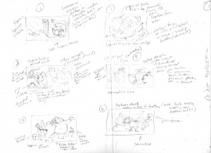
The next step is taking my written notes and roughing out the proposed illustrations in a series of small thumbnail sketches (NOTE:  I don’t expect you to actually see these very clearly, this is more to simply give the idea of the steps involved).

First rough thumbnail ideas

First rough thumbnail ideas

As the name suggests – these sketches are real small, only a couple inches wide – so i obviously don’t worry too much about detail or perspective or even where the words are going to go during this phase, this is just a way to start roughing in the layout.  It’s probably one of the hardest steps in the process because i’m staring at a blank page and trying to fill it.  I much prefer the next stages –  when i can start fine-tuning the sketches.

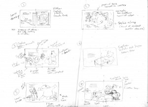
Cleaning up the thumbnail roughs

Cleaning up the thumbnail roughs

It may not look significantly different from the first batch of thumbnail sketches, but at this stage i start figuring out where the type is going to go and what my “live” area will be.  I really enjoy the editing process – whether it’s drawing or writing – and this is when i get to fine-tune the details.  Then it’s on to the last stage of the thumbnail process.

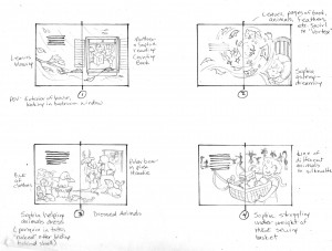
Finished thumbnail sketches

Finished thumbnail sketches

It’s all still rough, and each sketch still only a couple inches wide, but it’s enough to get the basic idea of what each full-page spread of the book will look like.  I suppose another term for it could be “storyboard”.  It’s the last step before i enlarge the rough sketches up to book size so i like to send these finished thumbnails to the publisher’s Art Director and Editor for their input.  It is not an official contractual deadline (which usually consists of:  Rough Sketches, Finished Cover Art, and Final Color Art) but i feel more comfortable having them see the direction i intend to go, just in case they have some concerns or alternative suggestions.

If they like the thumbnails… then it’s on to the Pencil Roughs.

The Ghost of Christmas Who & Other Relative Dimensions (2008)

January 1st, 2010

I know this is an older card… and that it is no longer Christmas… but i am nothing if not fanatically obsessive in my persistent way of linking disparate things together; and in my little world it made perfect sense to begin this New Year entry with an explanatory back-story about the Christmas card i did in 2008.  For one thing i love all the miscellaneous detail that went into the picture and wanted to share it with anyone who happens to stumble upon the illustration on the web site  (but didn’t get the note that accompanied the card when i originally mailed it).  For another (or B) i think the story/card pretty much lays the ground work for what to expect in future entries of 2010.  And basically i just love the drawing and wanted to share all the background stuff.

So, for those of you who enjoy long, involved, labyrinthine explanations of why an artist did what she did please enjoy the following story of…

The Ghost of Christmas Who & Other Relative Dimensions

The Ghost of Christmas Who & Other Relative Dimensions

2008 –

For those new to the experience, this is what my husband calls one of my “weird cards”, in that i practically pull a muscle trying to make random images of the year relate to each other… and the holiday.  You be the judge.

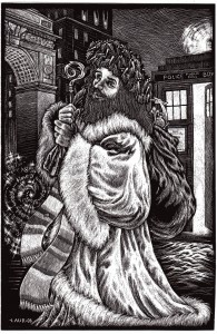
It started with the medium – scratchboard.  A kind of reverse process of etching into a thin coat of white clay that has been covered by black ink.  I learned the technique back in high school, but with the exception of a few attempts (the last of which was 11 years ago) i haven’t had much call to use it since.  Until this year that is, when i got a HUGE 4′ x 2.5′ project and wound up falling in love with the process again.  I just knew i had to do [2008’s] card this way.  Now i just had to come up with the subject, and decided to revisit my favorite Christmas story, “A Christmas Carol” since that hasn’t been used as an inspirational source since 1980.  I have long wanted to feature the Ghost of Christmas Present (my favorite of the Dickens spirits) and thought this would be the perfect opportunity.

And the whole card story would end there (and be a much shorter tale) if i hadn’t also felt compelled to shoe-horn in some reference to my newest current obsession of the year – Dr. Who.  [NOTE:  This should explain why The Doctor found his way into the 2009 card as well]

A British sci-fi TV program that depicts the adventures of a mysterious alien time-traveler known only as “the Doctor”, the show originally ran from 1963 to 1989, and then continued via radio shows, books, magazines, occasional specials, and even a play or two.  I remember the show from college, with Tom Baker playing the 4th Doctor (from 1974 to 1981) and later with Peter Davison (who played the part of the 5th Doctor until 1984).  [And regarding the numerical identifiers – the character isn’t officially numbered, he has the ability to “regenerate”, so when any given actor left the series the Doctor himself  remained – albeit with a completely new look and personality.  There have been 10 Doctors to date].  [NOTE:  2010 will see the 11th regeneration of the character]

The series was relaunched on TV in 2005 (featuring the newest, 9th incarnation of the Doctor) but i actually didn’t become aware of it until August 2008, with Doctor #10; and as is so often the case with me, immediately got hooked to the point of obsession.  I still recalled the Tom Baker version with nostalgic fondness, and i had a bit of a crush on Peter Davison way back when, but i love this new adaptation.  How could i resist a show of science fiction and fantasy (“galaxy far away” anyone), not to mention its “relativity” to another growing fascination – time & dimension, multiple universes and unified field theories.  The Doctor, you see, is a Time Lord, who travels between time and space and alternative dimensions in his multi-purpose time machine/space craft – the TARDIS (Time And Relative Dimension In Space) – saving worlds and battling monsters and basically doing all sorts of wonderfully improbable, paradox-defying, logistical time-looping things.

The TARDIS – locked, due to a defective “chameleon circuit”, in the guise of a blue 1950s-style London police call box – can instantly transport its occupants anywhere in time, space or history and it dawned on me what better way for Santa Claus to deliver presents around the world in one night, so that became my (perfectly logical) reason for linking it to the holiday.  Of course, that means the Ghost of Christmas Present wound up being more of a St. Nicholas figure, but i have always felt that Spirit was really just another variation of Father Christmas to begin with – so the concept still works.

Inspired by Dickens and Dr. Who it would probably seem logical to set the picture in London, but i didn’t want to be that obvious.  I mean, if you have access to a machine that can take you anywhere in the universe you should use it.  Besides, our daughter goes to school in New York so i decided to acknowledge that by putting the Washington Square Arch in the background.  Also, additional research into St. Nicholas revealed he was the patron saint of Manhattan (brought to New Amsterdam by the Dutch) so that cinched the setting choice.  And in another interesting coincidence i happened to notice that in most images of St. Nicholas he holds a staff that looks like a Question Mark – the very symbol often used in several of the Doctor’s different incarnations.  So there you have it ~ Scratchboard, St. Nick, New York, and Doctor Who = Laurie’s 2008 Christmas card!

That’s the basic backstory but, naturally, i can’t leave it there.  So with your continued indulgence, please allow me to explain a few of the other, seemingly random, visual bits and pieces found in this holiday greeting.

*  The Ghost of Christmas Present is dressed as Dickens described him, specifically  the wreath of holly and icicles on his head.  However – the tartan under-robe is mine in a blatant use of artistic license (added because i realized i had made his coat too short).  As previously noted, he carries St. Nicholas’ staff as well as Santa’s pack.

*  He also wears a scarf that was an iconic costume element of the 4th Doctor, as portrayed by Tom Baker.

*  The stalk of celery (in the pack) is a reference to Peter Davison’s 5th Doctor, who wore one on his lapel (“Brave choice, celery.  But fair play to you, not a lot of men can carry off a decorative vegetable.”  Line from episode: TIME CRASH).

*  The pocket watch and “sonic screwdriver” (also in the pack) are both nods to the 10th Doctor, David Tennant (and if you look closely, he is the one driving the TARDIS).

*  The vortex-y image on the left also contains a 10th Doctor reference, specifically his explanation of time, “People assume that time is a strict progression of cause to effect, but actually from a non-linear, non-subjective viewpoint – it’s more like a big ball of wibbly wobbly… time-y whimey… stuff.”  (from the episode BLINK) –

*  As well as – Einstein’s Field Equation (put the image upside down & turn) for a scientific approach to relativity.

*  And, finally, in the pack behind all the Dr. Who stuff is a dragon holding its tail.  That is an Ouroboros.  Discovered while reading “Godel, Escher, Bach” by Hofstader (one of those “time-y whimey” books) – it stands for, among other things, Eternity, Infinity, and (my favorite) Alchemy.  It also represents Circularity and no better image symbolizes my circular thinking, or the way things from my past keep reappearing in my present – particularly in 2008.  A dear friend from junior and senior high found me after a 30 year absence.  An obscure TV show from my college days once again came to my attention. And i rediscovered an art technique learned back in the 70s.

I keep a notebook of all the Christmas cards i’ve done since Freshman year of college (when the tradition began).  Several years ago i did a scratchboard card of Santa Claus (the first use of the technique since graduating from high school) and out of curiosity i pulled it out to compare techniques.  I didn’t entirely remember when i had done the card, so imagine my surprise – that scratchboard Santa was done exactly 20 years ago – Christmas 1988!  So to the amazing, the coincidental, the improbable, the magical, and the just plain weird…

That was how i ended the original story… but i think it pretty well sums up my hopes for the new year as well!

The “Fur & Feathers” Illustrations Have Left the Art Room

December 30th, 2009

This story begins in the middle – with the shipping of the 13 color illustrations and cover art for my 4th children’s book for Sylvan Dell Publishing, “Fur and Feathers“, by Janet Halfmann (author of “Little Skink’s Tail“, our first collaboration).  I just got word that all the drawings arrived at their destination safely  so i can breathe a sigh of relief and now my job is largely done, at least until the book itself is printed and bound and i can start officially sharing it (at book signings and school talks and various conferences).  I say we are in the middle of the story because the whole thing began earlier this year (around March/April 2009) and won’t come to it’s ultimate (hopefully successful) conclusion until nearly the end of the next one (Fall/Winter 2010).  It’s really a lengthy process getting words and pictures into finished book form – and kind of a fascinating one, at least from my perspective – so i thought it might be interesting to chronicle the whole affair from beginning to end.

Unlike my first two protracted blog entries, however, i shall attempt to keep the “Fur & Feathers” account a bit more concise.  I love this ability to write and describe and share the creative thought process but i realize i do have a weakness for verbosity.  I also know if i make the entries too long no one will read them (or they will doze off in the middle or worse, start skimming).  I know i certainly tend to skip articles that look too long, and completely avoid recipes of too many ingredients and instructions.  However, despite being aware of my long-winded tendencies i’m not going to promise brevity… only that i’ll try to keep these particular entries contained in smaller, easier to read, segments.

So we shall call this first account (in the “Fur & Feathers Category”)  the “F&F Intro”, even tho it takes place 10 months after the actual beginning of events.  And to further the out-of-kilter continuity the attached cover illustration doesn’t technically enter the narrative until 5 months later, but i thought we needed a visual image to start the tale  (and it does – eventually – become the approved cover design, so i’m giving a bit of a preview to up-coming events in the hopes of pricking your interest).  Welcome to “The Fur & Feathers Journey”….. or….

Fur & Feathers: How It Becomes A Book

Fur & Feathers: How It Becomes A Book

Auld Lang Syne In the Land of Let’s Pretend (w/ bagpipe & fanfar)

December 24th, 2009

I have been drawing my own Christmas cards since college.  The first one began as an assignment but every Christmas after that i just liked having the creative outlet.  The designs started out simply enough – variations on traditional holiday icons – but before long i began getting more adventurous.  It wasn’t long before i started coming up with little stories to complement the picture, and added that to the back of the card.  Over time however the stories started getting more complicated, or  the illustrations did – becoming a kind of visual version of a Year in Review letter only with lots of hidden subtext.  Thus requiring a full sheet of paper… and very small type.

All this is by way of a Preface for my 2009 Christmas card and the story behind it.  Now besides simply showing the work i can also share the behind-the-scenes details and inner workings of my convoluted thought process.  So sit back, relax, maybe stock up on some food and beverages cos this might take awhile, and allow me to share the explanation that accompanied ~ “Auld Lang Syne In the Land of Let’s Pretend (with bagpipe and fanfare)“.

AuldLangSyne&Tali663

It’s that time of year again ~ time for Laurie’s seasonal homage to current interests, obsessions, and the year’s events and activities, the Rorschach Test known as my annual Christmas card.  While i really intended this one to be less complicated then usual those familiar with the process know even the most simple idea tends to have a convoluted story behind it and this year is no exception.  So let the elucidation begin.

The original idea was born in October at my alma mater, Maryville College.  I had been invited to do a book signing for Homecoming and Oblivious Me didn’t realize it also happened to be my 30 year class reunion (i’m terrible with numbers so didn’t notice the date but friends suggested i was simply in denial) so Reunions and Reconnections became something of the underlying theme for the card.  And it began with the Scottish Terrier.

I should note here that i have long loved Scotland (we have relatives in Ayrshire, the Children’s Hospice Association Scotland has a few of my books, and this year i met a delightful couple from Edinburgh on the A Train from JFK) and while it has been a source of artistic inspiration oddly enough i had completely forgotten Maryville College had a strong Scottish connection (we were the Fighting Scots after all, with a Scotty dog mascot.  We even have an official tartan).  Once i was reminded of this past link i knew i had to celebrate it in this year’s card and figured the Scottish terrier was a natural place to start.  Problem is, we do not own a Scottish terrier which i feared might cause some confusion (our dog heralds a bit farther south: Wales to be exact).  But then i thought – why not include our new Welsh corgi, Taliesin (named for the famous Welsh bard, tho we call her Tali for short) since she has yet to be featured in a card, and this will be her second Christmas with us.

And that was the card, tho obviously i couldn’t leave it at that.  I wanted to include some of the year’s other hi-lights so that’s what prompted the addition of the standing stone.  I’ve used them before [refer to the 2007 card ~ “Tasha & Taliesin, In the Company of King Arthur’s Bard”, which also happens to feature our first corgi], but what better way to include a whole bunch of disparate ideas (not to mention tie into the Celtic theme) then by carving them into a Pictish stone which, in this case, was specifically inspired by [another connection] a book on the Picts recently given to me by our Scottish relatives.  Historically there is some debate about what the various stones, circles, and carvings might mean, but speaking as an artist who likes to tuck the occasional personal image into her work i can easily imagine a few ancient sculptors including their own obsessions and memorable events into their commissioned designs (i just use paper while they use rock).  And this year was full of memorable events.

For one thing, i now have this web site (new this year).  For another, i painted a series of murals for two local elementary schools:  J A Crookshank (represented by their mascot, the Cougar) and Ketterlinus (represented by their mascot, the Dolphin).  The dolphin carving serves multiple purposes as it also represents a couple other projects – my first residential mural (an under-the-sea theme featuring three dolphins) and the 47 species of dolphins i drew for SeaWorld (36 Oceanic Dolphins, 5 Fresh Water/River Dolphins, and 6 Porpoises).

As for the obsessions ~ interest in Doctor Who continued from last year [featured in last year’s scratchboard card ~ “The Ghost of Christmas Who…” ]  particularly when my daughter, Jesse, got hooked on the show over the summer (my wonderful partner in crime).  And since this will be our Doctor’s last year (sadly he regenerates into a new guy in 2010) i specifically wanted to include him and the TARDIS in this card.  Other Doctor Who references include the Gallifrey Time Lord Seal of Rassilon and Tali is wearing the scarf favored by the 4th Doctor (who i first encountered back in college – note the returning connection).  Also, the music wafting above the stone is not Auld Lang Syne, despite the title of this card, but is instead the final bars of the Doctor’s original, hand-written, symphony, “Ode to the Universe” (as seen in his Music of the Spheres concert appearance).

Of course no card would be complete without Jesse’s and my original Mother/Daughter obsession – Star Wars, especially since we both saw “Star Wars In Concert” (albeit separately and in different states), thus combining both music AND obsession.  To that end (and to mirror the Doctor Who images) i included Obi-Wan Kenobi  and the Rebel Alliance insignia on the stone.  And to further the musical emphasis Tali holds a Fanfar, the wind instrument played by Tedn D’hai of the band, the Modal Nodes (aka: The Mos Eisley Cantina Band).

Which brings us to the most memorable event of all, represented by the box at the base of Tali’s stone.  As mentioned in my bio on the Contact page, when i was a little girl in Philadelphia one of my favorite TV shows was Cartoon Corners General Store, hosted by Gene London.  Mr. London told stories and illustrated them on big pads of white paper and i have long credited his show, and his drawing, as inspiring me to be an illustrator.  I mentioned this in an Internet interview earlier in the year and a short time later received an e-mail from my publisher, forwarding a letter they had received on behalf of London Studios.  GENE LONDON himself wanted to contact me!  Words cannot express my thrill, but perhaps the picture can.  My parents once took me to a taping of Cartoon Corners and as one of the kids in the “peanut gallery” i got to draw a design on Mr. London’s drawing pad which he then turned into a picture.  Sadly i no longer have the sketch he drew but i do have the memory of a squirrel that he made out of my squiggle.

And one last note before i bring this tale to an end.  Often i spend as much time coming up with the titles of my cards as i do drawing them but “Auld Lang Syne” seemed an obvious choice for an illustration of a Scottish terrier playing a bagpipe inspired by a college reunion (“Ode to the Universe” aside).  Of course, much like the card itself, it would have been far too easy to end there.  Then i remembered seeing the lyrics to the song Mr. London sang just before he’d tell a story, the final line of which was, “In the land of Let’s Pretend”.  Brilliant!

So with that, the links and connections, the reunions and the remembrances, the music and magic are complete.  To old acquaintances & cherished friends, Time Lords & Jedi Knights, sculptors & storytellers ~ Merry Christmas!

A Test of (Introduction to) Laurie’s Eclectic Blogcast System

December 17th, 2009

It works!  I think.

Okay, this fumbly-bumbly jumble of words, overly-long run-on sentences, and parenthetical asides is actually a test of the new blog feature on my web site.  If all goes well it will also be the first official posting (because we might as well all explore this brave new world together).  That’s not to say there won’t be some tweaking and editing and alterations before the final, official publication but this will certainly (hopefully) be the gist.

And why a blog one might ask?  Particularly since not so very long ago i never entertained the notion.  Of course not so very long ago (end of last year in fact) i never entertained the notion of a web site either, so i guess this is just the next natural progression step along the process.  Basically, even tho i work drawing pictures i am fascinated by the written word.  I love to read and i absolutely adore books (which probably explains why i always wanted to be an illustrator) and in my spare time, when i don’t have a book handy, i like to write.  While some folks knit or play golf or fashion little animals out of pipe cleaners for relaxation, i enjoy writing.  Letters, journal entries, lengthy diatribes about art and philosophy (why the sea is boiling hot and whether pigs have wings – that sort of thing) on the computer or in my trusty 3-ring binder, i love the look and feel of words.  Ah, but i digress (which, warning to the casual reader – i do frequently)… i was attempting to explain about the blog.

Basically it started out simply to be a little additional feature of the web site where Someone (have i mentioned i have an AMAZING team of web wizards and computer geniuses who do all this work for me because i am a complete dinosaur when it comes to modern technology??) could post up-coming book signing events, new art projects, and related links and articles about said projects & events.  Then it was suggested that if i had a blog i could do it myself, with the added benefit of having a little place where i could wax poetically about my work, or art in general, because just about everything i ever draw has a story behind it – which i will tell at the drop of a hat.

Either the illustration itself has visual elements that need explaining, or there is an emotional backstory about the project where i came unglued, burst into tears, and drove everyone around me completely insane whining how things weren’t working out.  With the blog i can have the best of all possible worlds combining basic News & Events information AND writing!  Sharing  all that psychological, creative artist-angst, baggage with the world (or at least those poor souls who inadvertently stumble onto the site looking for the other Laurie Klein of which, apparently there are several).

So with that explanation (and cautionary warning) aside allow me to publish this puppy and see if i did it correctly.  Whether i did, or didn’t, eventually we’ll work the bugs out (my computer friends are the most patient understanding folks in the world – either that or when i call i simply sound like Charlie Brown’s teacher, “Waa, waa,waa,waa” and i’m mistaking their glazed look with sympathetic understanding).  So to those unsung heroes – Mark, Cass, Shaun, & Bill, who designed, built, maintain, and otherwise take care of all this (and send me bills) i dedicate this – my very first blog entry, on my still very new web site –  to you.  Thanks for everything, i truly sincerely could never do it without you!

So, as The Doctor [who] would say…  Allons-y!