Archive for April, 2010

Fur & Feathers: Chapter 7 – Cover Stories

Saturday, April 24th, 2010

So the pencil roughs for Fur & Feathers were finished (and shipped by the due date of July 20) and now it was time to turn my attention to the cover, which was due by August 15 (and when i say “due” i mean – finished color by August 15 – not just rough pencil ideas).  Sylvan Dell needs cover art before the interior illustrations for marketing purposes, but they like to have the illustrator start thinking through the entire book first, so that’s why they ask for the rough sketches before the cover.  Presumedly, while you’re busy working on the individual pages, cover ideas are already starting to gel.  But not necessarily.

Some book covers just come easier than others but usually (at least in my case) the process takes a little more time and creative energy, with the added complication (again for me, as i described in a letter to a friend) “the cover has to be colored and finished before i’ve even actually finalized the look and style of the book illustrations.  If i put the main character on the cover that character has to look the same thruout – meaning not only do i have to design a cover i also have to fully realize whatever character or characterS are shown.  Plus nail down the color technique (i can’t do the cover in paint with a realistic look and then decide the illustrations should be in cut-paper abstract collage for example).”  [NOTE:  As that excerpt suggests, many times my rough sketches are VERY rough, and i polish the images up before i actually go to color]

Also F&F was a bit more complicated in that i really couldn’t come up with an easy,  explain-the-story-in-one-image-without-giving-away-any-surprises idea.  The story itself is really kind of hard to describe without pretty much telling the whole thing.  “Because of a wind storm, a little girl has trouble falling asleep so she and her mother count animals, and in her dreams the animals and the wind get all smooshed together and the storm winds up blowing all the animal’s fur and feathers and coverings off, so the little girl has to fashion new ones using materials from her grandmother’s sewing box – after discarding the idea of using her own clothes.

I thought of using the swirly vortex image, but i wanted that to be a surprise.  Nor did i want to give away the cute whimsy of Sophia dressing the animals in her own clothes.  There was also the dilemma of there being 8 featured animals besides the little girl which could get kind of cumbersome for one picture.  You do have to leave some subjects for the interior after all.  In the end i decided to concentrate on Sophia and the first two animals met in the story – the polar bear and the duck.

Rough cover idea - 1

Rough cover idea - 1

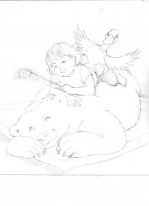
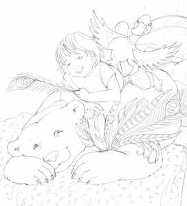
The whole story takes place in Sophia’s bedroom, and there is something just kind of funny about animal’s butts (what can i say), so that is what prompted the first idea.  I should also note that while i had the p bear and duck “dressed” in Sophia’s clothes i had every intention of coloring them as if they still had their original fur and feathers (to avoid the whole “naked animal” dilemma of an earlier chapter).

Rough cover idea - 2

Rough cover idea - 2

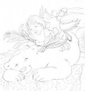
The polar bear just naturally lent himself to posing as a bear rug, so that inspired the second idea.  With the addition of the quintessential feather – a peacock plume.

Rough cover idea - 3

Rough cover idea - 3

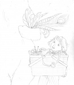
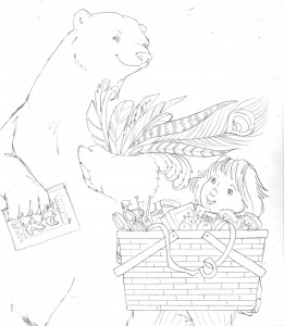
I like extreme close-ups, and the idea of this huge polar bear beside the little girl struck me as funny. It also conveyed a bit of mystery about the nature of the animals and what they had to do with the story (and i could introduce the grandmother’s HUGE sewing basket).

Rough cover idea - 4

Rough cover idea - 4

Rough idea #4 is obviously a variation on idea #3, just in case the image of a headless bear was unnerving or struck anyone as odd.  He’s carrying the book i kind of invented (to explain why the little girl and her mother were counting animals) mostly to give him something to do with his paw.

Rough cover idea - 5

Rough cover idea - 5

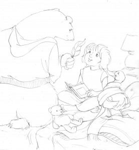
And – finally – i kind of went full circle and did a variation of the first idea, having Sophia face the reader (thinking that might make it feel more engaging, as opposed to looking at everyone’s back).

I sent everything off to Sylvan Dell and awaited their thoughts and feedback:                                  “Sketch 1 – people didn’t like having the backs to us. Omitted as cover option… but several staff commented on what a great piece of art it would be for the back of the book.   Sketch 2 – Lee liked this one best but wondered about the rug.  But I don’t know what else you could use for them to be on.   Sketch 3 – This was another favorite and one thing that the staff kept saying that they liked were the variety of feathers… That led to a conversation about what if there were more feathers in #2.   Sketch 4 [NOTE: Idea #5 isn’t mentioned because it was sent later] – Like better than one for sure for cover but let’s see #2 with more feathers.

Which prompted …

Revised cover idea -2 (with more feathers - polar bear)

Revised cover idea -2 (with more feathers - polar bear)

And…

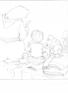
Revised cover idea #2 (with more feathers - Sophia)

Revised cover idea #2 (with more feathers - Sophia)

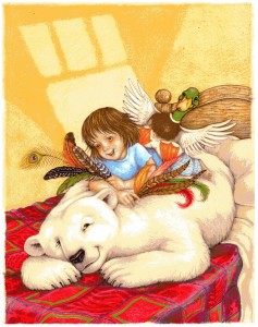
And in answer to the question of what to do about the rug, in the original sketch proposal, i decided to move everyone to the bed.

August 7 i got the news –  “I think we should go with this one.

Fur & Feathers cover art

Fur & Feathers cover art

Of course that’s how it looked when i finished it, obviously i still had to color everything in.  But that – and the whole coloring process in general – will come in the next chapter.
Happy Birthday, Nana

Thursday, April 8th, 2010

Today – April 8 – happens to be my grandmother’s birthday.  She went by many names: Lillian, Sis, Mother.  My brother and i called her Nana.  Or “My Nana” as i often have to say now, because my mother inherited the title when my daughter was born so when reminiscing about my childhood with Jess, i have to make the distinction to avoid confusion.  Anyway, at 4 this morning i happened to wake up and suddenly got the whim to post a detail of a drawing i had done of my Nana on my fb wall (yeah, i got sucked into that vortex – but that can be another blog) to celebrate her birthday and her memory.   The beauty of being an artist is – you so often have the odd piece of art just lying around to be used at such random, impulsive insomniatic moments.  And – to be honest – i also thought i could make this a fairly short blog.  We’ll see.

The illustration had been done for the Christmas card the year our daughter was born, really as something of a combination birth announcement/holiday greeting, and originally was just going to feature our new baby.

Thumbnail of Great Granddaughter Card

Thumbnail of Great Granddaughter Card

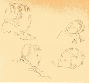
To that end i did a series of little sketches trying to work out the best angle of our little angel.  The quintessential, five-month-old, new baby pose.  The angel angle if you will.  The smiley one – with her tongue sticking out in pure baby glee – was the obvious choice.

Baby Poses

Baby Poses

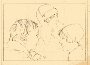
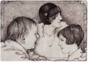
I don’t recall now exactly what prompted me to include the great grandmothers in the picture (as opposed to the more obvious new parents or immediate grandmothers) but such is the nature of creative whimsy.  I think it was simply because Bob had grown up with his “Nonnie” and i had grown up with my “Nana” AND we just so happened to have these great photos of the two women – as flappers.  That was simply a heritage and a legacy too wonderful to pass up.

Pencil Rough of "The Great Granddaughter"

Pencil Rough of "The Great Granddaughter"

And, of course, i managed to come up with an appropriate story ~

Some of my strongest childhood memories are of Christmas at Mammy’s house.  She was my great grandmother and her biscuit cookies were legendary.  Christmas is a time of magic and remembrances but unfortunately Jesse won’t have memories of her great grandmothers, and no one has ever been able to duplicate Mammy’s recipes.  She will, however, have the cherished photographs, the old letters and the sepia tinted stories of her parents and grandparents.  And I know that Nana and Nonnie are sharing her Christmas.

The Great Granddaughter, Nana & Nonnie

The Great Granddaughter, Nana & Nonnie

So to Lillian, Sis, Mother and Nana… Happy Birthday!

Meet the Planets: Giant Characters, Teeny Tiny Thumbnail Sketches

Sunday, April 4th, 2010

Okay, so the “best laid plans” as they say (tho why Mice and Men both have plans that often go awry still escapes me).  I fully intended to write about the “Meet the Planet” illustration process – AS I DID IT – but here i am, nearly finished with the pencil rough sketches and not a written word to be seen since the initial intro.  Actually i think this step was kind of addressed in an early chapter of “Fur and Feathers” – i always seem to be juggling numerous projects simultaneously so free time is at a premium and finding time to sit and write often difficult.  And, i’ll be honest, sometimes – after drawing all day – i really just don’t want to tax my brain any more with creative musing and the last thing i want to to do is try and wring out any more creative juices in the form of literary analysis.  However, things are zipping right along and i don’t want to get any farther behind.   So, by way of quick recap…

I got the new manuscript on February 11, with pencil roughs due April 9, and immediately ran off to the bookstore scooping up everything i could find on planets, astronomy, the universe, galaxies, and space.  I already have a fair number of reference things at home (Carl Sagan’s “Cosmos” – book and DVD, “Comet” and “Murmurs of Earth”, a Time/Life series on natural history and the universe, a stack of Kids Discover and Scientific America magazines, an eclectic Star Wars and Dr. Who collection) so after adding to the library coffers i simply spent the next several weeks reading and absorbing and musing.  I got so caught up in all the wonderful extraneous details and information in fact i kind of lost track of time and suddenly realized it was the first week of March and i had yet to put pencil to paper.  But my mind was at least full of possibilities!

Per a pattern that was established with the very first book i did for Sylvan Dell (“If A Dolphin Were A Fish”) i began with small thumbnail sketches of each page, to make sure SD was comfortable with the direction i intended to take.   This book is quite the departure from the nature-based animal books i’ve done in the past and the sky (or the cosmos) really was the limit in terms of stylistic direction.  This is the kind of project i just go crazed over – a seemingly simple little, self-contained topic that winds up embracing everything from history and literature, to invention and philosophy, to mythology  and art, to several branches of science and classical music.  And don’t even get me started on pop culture possibilities.

I finally started roughing out the thumbnail sketches the first Friday in March (3/ 5) and got into such a groove i finished them up that following Wednesday (3/10). The small rough drawings gave a pretty fair idea of what the finished full-size pages would/will ultimately look like, but there was so many other little details involved i wound up including a little explanatory note for each page.  And those, more than anything, best describe the process.

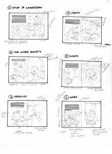
Per the attached note that accompanied the sketches:

Thumbnails: Pages 1 - 6

Thumbnails: Pages 1 - 6

*I’m using Stonehenge as a backdrop/stage for the “Competition”.  I wanted to bring the “History of Astronomy” element, and while there is some debate about what the standing stones mean, most people seem to agree they were erected to record certain celestial events and it’s instantly recognizable as such.  It’s something of an iconic monument (better known than the Chomsung Dae Observatory in Korea for example).

*I’m still developing the actual look/personalities of the planets – but i’m pretty much leaning toward keeping them actual “planets” (as opposed to some sort of human incarnation), with unique expressions and simple appendages.

As for specific visual features of each page (that may need some explaining):

Page 1 – Intro to the Competition:  The audience will be largely in shadow and silhouette but comprised of personified moons, comets, as well as historical figures and icons affiliated with space, astronomy, science fact and fiction, etc. Our spiral galaxy (Milky Way) is in the corner.

Page 2 – Intro of the Inner Planets:  All 4 – in their respective garb/persona. Big sun (wearing sun glasses).  Asteroid belt in distance.

Page 3 – Mercury:  In classic pose of statue of Mercury (with winged helmet and boots).  Huge sun behind massive stones – to emphasize he’s small.  Followed by the “Messenger” space probe (which goes into orbit around the planet in 2011).

Page 4 – Venus:  Play on Botticelli’s “Birth of Venus” with Voyager, Venera, and Mariner space probes playing the part of the three surrounding angels.  Venus stands on a representation of her flat planetary volcanoes (rather than a clam shell).

Page 5 – Earth:  “Mother Earth” wears a crown of daisies and carries flowers (or something “natural”).  She is surrounded by the different atmospheric layers (light blue to black – or real dark blue).  North Star (Polaris) and circumpolar stars.constellations shown.  Moon applauds.

Page 6 – Mars:  In Roman warrior attire standing on “Sojourner” rover chariot.  Towering standing stones to help make him look smaller than Earth and Venus.  In audience: Schiaparelli and Lowell (who drew the canals), the two lumpy moons, H. G. Wells (reading “War of the Worlds”), some aliens/Martians, and robots.  Again Polaris and constellation where Mars might be best located (in 2010-2011 – if possible.  Otherwise it will be an historic reference).

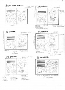
Thumbnails: Pages 7 - 12

Thumbnails: Pages 7 - 12

Page 7 – Intro of the Outer Planets:  Similar idea as the intro of the Inner Planets – only with the Sun (and the rest of the solar system) far away.  Some comets circle around.

Page 8 – Jupiter:  Dressed as a Roman god (or Caesar). One foot on Stonehenge it buckles under his weight.  In the audience are the 4 biggest “Gallean” moons (discovered by Galileo, who is also in the audience).  Sitting beside Galileo is Magellan who discovered the Magellanic clouds (and navigated by them) – which are in the background behind Jupiter.

NOTE:  With the Outer Planets i’m trying to introduce different discoveries and observations way out in the cosmos (such as the Magellanic clouds).

NOTE:  As with the Inner Planets i’m also attempting to have the North Star and a reference to a significant constellation (either where the planet can be found in 2010/2011, or where it was discovered originally) in each illustration.  In Jupiter’s case – one of his moons, Callisto, is named for the woman Jupiter/Zeus turned into Ursa Major (along with her son, who became Ursa Minor).

Page 9 – Saturn:  He’s suave, touching the “brim” of his ring as if he were tipping his hat.  He’s floating above Stonehenge (being the lightest of the planets).  Behind him are the different types of galaxies, as discovered by Hubble (who is in the audience).  Also in the audience – 3 or 4 of Saturn’s distinctive moons, as well as Christian Huygens – who discovered the rings (he’s holding a copy of the sketches he made).

Page 10 – Uranus:  He is tripping over Stonehenge – to account for orbiting on his side.  His odd moon, Miranda, is hiding her eyes (it was thought she was broken apart and fused back together by gravity – thus explaining her fractured appearance.  Or maybe because Uranus fell on her).  We are getting into deep space now so the Voyager probe as well as a binary code message are in the background.  In the audience are Herschel (who discovered Uranus) and his sister (who was an astronomer in her own right, and also helped Herschel.  She supposedly fed  him sandwiches while he worked so she’ll have a plate in hand).  With the Herschels is Carl Sagan, holding the gold video disc that is carried by Voyager.  The disc looks like a record and Herschel was also a musician – so i couldn’t help but make the connection.  Herschel also discovered Uranus in the constellation Gemini – so that’s in the sky somewhere as well.

Page 11 – Neptune:  Brooding and stormy (tho handsome) Neptune is standing on Stonehenge staring out into the cosmos – reflecting on what is beyond.  Above him, in the distance, Voyager leaves the solar system heading to various galaxies, nebula, quasars, and black holes.  Triton, the biggest moon, is going backwards.  In the audience LeVerrie and Adams (who both, separately, discovered Neptune mathematically) are working out the equation on a chalkboard, while Galle (who took their computations and found the planet visually) looks thru a telescope.

NOTE:  Neptune – moving so slowly – can be found in the constellation Aquarius until 2012.  He also completes his first orbit around the Sun in 2011 (since being discovered!) so if i can figure out a way to illustrate that i’ll include it.

Page 12 – You Choose:  This one is pretty obvious.  Kind of a mirror of the first page with Pluto and the audience all looking at the reader.   The audience will be filled with planets and aliens and historic/scientific  figures, and all the planets will be “on stage” together.

On March 10 i received an e-mail from Sylvan Dell:  I love where you are going with this!  I think you are having fun…

And the fun continues………….