Archive for the ‘Fur and Feathers’ Category

Fur & Feathers: Chapter 8 – Hue & Cry, Going to Color

Sunday, September 19th, 2010

While the actual definition of the phrase “hue and cry” refers to a public clamor or stir i mean it quite literally.  HUE, “as in a particular gradation of color“, often makes me CRY!  I have something of a love/hate relationship with color in that… i really don’t know what i’m doing when it comes to working with it.  Pretty ironic given what i do for a living, and if one has looked at the various images in my portfolio and books it might sound a bit disingenuous (given all the colorful stuff in there), but really – if things look nice it has a lot more to do with luck or accident than any real grasp of the concept on my part.   I’m truly much more comfortable with a trusty #2 pencil (Paper-Mate Mirado Black Warriors are the best!!).

That being said, i should clarify that i am comfortable coloring specific items or objects – like animals or plants.  If something has to look like a particular thing, or match an exact reference, i’m your gal!  That kind of coloring is fun and there is nothing i enjoy more than a faux finish or trompe l’oeil image.  Where i get into trouble is doing detailed backgrounds or coming up with mood and shadow and tone.  In the case of “Fur & Feathers”, however, i must admit my chapter title is misleading in that i don’t think i cried at all during the process (i just wanted to use the phrase).  That’s not to say there wasn’t the occasional emotional upheaval (i am a “temperamental artist” after all)  only that coloring F&F actually didn’t bring the usual angst.

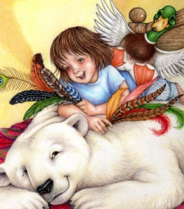
For me, choosing the color palette is always the most difficult part.  NOTE: I know we’ve been here before with this image, but i thought a bit of up-close detail might help explain the mental process.

F&F-Cvr(feathers)168

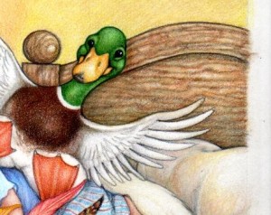
As mentioned earlier, the color of the animals and the individual feathers – all established in nature – was easy (and those feathers are all based on real natural patterns, by the way, with a few costume ones thrown in)  and i had already decided what i wanted Sophia’s pajamas to look like (a nod to the 10th Doctor from the “Christmas Invasion” episode of Doctor Who) the rest was something of a blank.  I really had no idea what the background – specifically, Sophia’s room – should look like, or what color it should be.

I did know i didn’t want her room to be stereotypically pink and girly so i looked through all sorts of home decorating magazines and books to get inspiration and eventually came across a picture of a room with lovely warm yellow walls and this great red and green and pink bedspread.  Feminine without being fussy it fit my needs perfectly – i just changed the headboard and spread.

F&F-Cvr(headboard)169

As i recall, the headboard in the magazine photo was a white iron thing, a little too flimsy and – to be perfectly honest – complicated to reproduce multiple times.  A nice wood headboard not only added a bit of a masculine touch (for boys in the audience) but creating wood finishes is quick and easy, and when you’re coloring 13  17″ x 10″ spreads you grab some ease wherever you can find it.

Of course whatever time i saved coloring a solid wood headboard was off-set by the elaborate bedspread i ultimately designed.

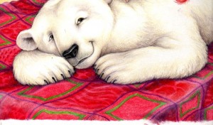
F&F-Cvr(bedspread)167

The spread in the reference photo had a flower pattern and while it was very subtle i didn’t want a floral image.  Instead i decided to go with alternating squares of animal and feather patterns as little visual play on the fur and feathers of the title.  Of course once you commit to a pattern you have to reproduce it every time that particular image comes up throughout the book, but i often use a sort of assembly-line approach that serves me well  for those circumstances.  When an image repeats from page to page i tend to go through and just color that specific image each time it occurs – first all the bedspreads, then all the times Sophia showed up, then all the polar bears and ducks, then the sewing basket, etc.  Once all the major foreground items and characters are done i go back and color in the background.

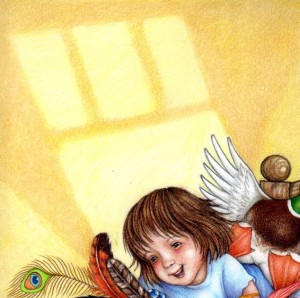
F&F-Cvr(wall)166

Because i had to leave room for the title there needed to be a clear space at the top of the page but i wanted to convey the idea of a wall in the background, as well as add a little textural interest.  I thought of all the neat patterns that can appear on a bedroom wall from ambient moonlight or street lamp reflections and thought that would break up the area nicely.  That use of geometric shapes could then be applied to the background spaces throughout the rest of the illustrations.  Decisions made for the cover were then carried on throughout the rest of the book.

Color palette decided, and background issues resolved,  it was now time to go to finished art.
Gettin’ Back Into the Blog w/ Up-Coming Fur & Feathers Events

Thursday, September 2nd, 2010

It has been far, far too long since i last wrote anything.  It certainly has not been from lack of subject matter or interest… i just got busy.  Crazy busy!  Insanely chained-to-my-drawing-table- every-day busy.  Somehow lost the whole summer busy.  That busy.

Basically i got swallowed up doing the illustrations for the planet book (that will come out Spring 2011 – and will soon be getting it’s own blog series) and that sucked up all my creative energy.  By the time i’d finished coloring planets and starry night backgrounds – plus an additional wealth of guest appearance background characters from history, science, math and the arts – all day (every day, for the past 3 months) i had no energy left for thoughtful literary musing, i just wanted to flop in front of the television.

Yes, i do that.  I’d love to say i went for long, introspective walks along the beach, or sat absorbed in classic literature (those quaint and curious volumes of forgotten lore we’ve all heard so much about), but no… i’d pour myself a glass of wine, pull out the chips ands cheese (or other junk food favorite) and watch repeats of all the alphabet shows: CSI, NCIS, SVU until bed.  That was all my poor battered attention span could handle. But all that is now behind me!

Well, okay, that’s an over-statement; the planet book illustrations are indeed behind me…  but all that other stuff is still very much part of my routine, and i have always had the attention span of a flea – so who am i trying to kid?  Let’s just say, now that the planet book illustrations are done, shipped,  and going thru the lengthy alchemy of becoming a finished published book it is time to return to the already finished published book that absorbed this blog for so many entries:  Fur and Feathers!

There are still a few blog chapters left to post describing the illustration journey that was/is  F&F, but before i resume that narrative i need to cleanse the mental palate (so to speak) and thought the best, easiest way was to list a few up-coming “Fur and Feathers” Book Signing/Promotional Events (descriptions of which will, undoubtedly, eventually become fodder for additional F&F chapters).  So…..

F&F book cover980

First Friday (St. Augustine, FL): Book Signing at Simple Gestures.  Friday, Sept. 3.   5 – 9

Florida Heritage Book Festival (St. Augustine, FL):  Children’s Program at the Flagler College, Ringhaver Student Center.  Saturday, Sept. 25.  1 – 2  [NOTE:  My program runs from 1 to 2, but i’ll be there all day, signing books and schmoozing at the Nature Nook table].

Maryville College Homecoming (Maryville, TN):  Little Scotties Activity Area – storytelling at the Maryville College campus.  Saturday, Oct. 23.  10 – 1

Micanopy Fall Festival (Micanopy, FL):  Book signing at the Nature Nook booth.  Saturday, Oct. 30.  Time to be announced (but i’ll probably be there most of the day).

Ocali Country Days (Ocala, FL):  Book signing at the Nature Nook booth.  Saturday, Oct. 30.  Time to be announced.

Right Whale Festival (Jacksonville Beach, FL):  Book signing at the Nature Nook booth.  Saturday, Nov. 20.  Time – again – to be announced.

Now let’s see what new stories i can generate!!!

Fur & Feathers: Chapter 7 – Cover Stories

Saturday, April 24th, 2010

So the pencil roughs for Fur & Feathers were finished (and shipped by the due date of July 20) and now it was time to turn my attention to the cover, which was due by August 15 (and when i say “due” i mean – finished color by August 15 – not just rough pencil ideas).  Sylvan Dell needs cover art before the interior illustrations for marketing purposes, but they like to have the illustrator start thinking through the entire book first, so that’s why they ask for the rough sketches before the cover.  Presumedly, while you’re busy working on the individual pages, cover ideas are already starting to gel.  But not necessarily.

Some book covers just come easier than others but usually (at least in my case) the process takes a little more time and creative energy, with the added complication (again for me, as i described in a letter to a friend) “the cover has to be colored and finished before i’ve even actually finalized the look and style of the book illustrations.  If i put the main character on the cover that character has to look the same thruout – meaning not only do i have to design a cover i also have to fully realize whatever character or characterS are shown.  Plus nail down the color technique (i can’t do the cover in paint with a realistic look and then decide the illustrations should be in cut-paper abstract collage for example).”  [NOTE:  As that excerpt suggests, many times my rough sketches are VERY rough, and i polish the images up before i actually go to color]

Also F&F was a bit more complicated in that i really couldn’t come up with an easy,  explain-the-story-in-one-image-without-giving-away-any-surprises idea.  The story itself is really kind of hard to describe without pretty much telling the whole thing.  “Because of a wind storm, a little girl has trouble falling asleep so she and her mother count animals, and in her dreams the animals and the wind get all smooshed together and the storm winds up blowing all the animal’s fur and feathers and coverings off, so the little girl has to fashion new ones using materials from her grandmother’s sewing box – after discarding the idea of using her own clothes.

I thought of using the swirly vortex image, but i wanted that to be a surprise.  Nor did i want to give away the cute whimsy of Sophia dressing the animals in her own clothes.  There was also the dilemma of there being 8 featured animals besides the little girl which could get kind of cumbersome for one picture.  You do have to leave some subjects for the interior after all.  In the end i decided to concentrate on Sophia and the first two animals met in the story – the polar bear and the duck.

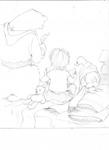
Rough cover idea - 1

Rough cover idea - 1

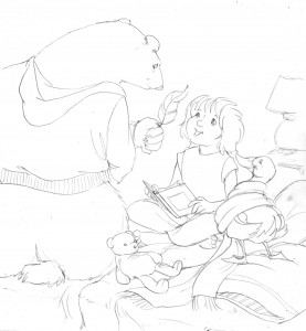
The whole story takes place in Sophia’s bedroom, and there is something just kind of funny about animal’s butts (what can i say), so that is what prompted the first idea.  I should also note that while i had the p bear and duck “dressed” in Sophia’s clothes i had every intention of coloring them as if they still had their original fur and feathers (to avoid the whole “naked animal” dilemma of an earlier chapter).

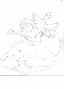
Rough cover idea - 2

Rough cover idea - 2

The polar bear just naturally lent himself to posing as a bear rug, so that inspired the second idea.  With the addition of the quintessential feather – a peacock plume.

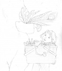
Rough cover idea - 3

Rough cover idea - 3

I like extreme close-ups, and the idea of this huge polar bear beside the little girl struck me as funny. It also conveyed a bit of mystery about the nature of the animals and what they had to do with the story (and i could introduce the grandmother’s HUGE sewing basket).

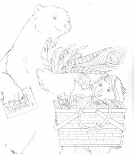
Rough cover idea - 4

Rough cover idea - 4

Rough idea #4 is obviously a variation on idea #3, just in case the image of a headless bear was unnerving or struck anyone as odd.  He’s carrying the book i kind of invented (to explain why the little girl and her mother were counting animals) mostly to give him something to do with his paw.

Rough cover idea - 5

Rough cover idea - 5

And – finally – i kind of went full circle and did a variation of the first idea, having Sophia face the reader (thinking that might make it feel more engaging, as opposed to looking at everyone’s back).

I sent everything off to Sylvan Dell and awaited their thoughts and feedback:                                  “Sketch 1 – people didn’t like having the backs to us. Omitted as cover option… but several staff commented on what a great piece of art it would be for the back of the book.   Sketch 2 – Lee liked this one best but wondered about the rug.  But I don’t know what else you could use for them to be on.   Sketch 3 – This was another favorite and one thing that the staff kept saying that they liked were the variety of feathers… That led to a conversation about what if there were more feathers in #2.   Sketch 4 [NOTE: Idea #5 isn’t mentioned because it was sent later] – Like better than one for sure for cover but let’s see #2 with more feathers.

Which prompted …

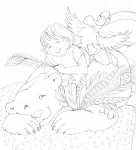
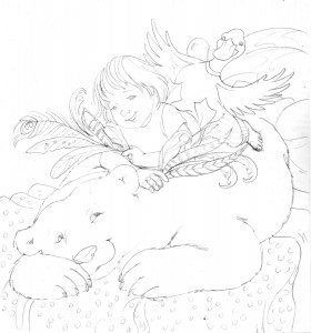
Revised cover idea -2 (with more feathers - polar bear)

Revised cover idea -2 (with more feathers - polar bear)

And…

Revised cover idea #2 (with more feathers - Sophia)

Revised cover idea #2 (with more feathers - Sophia)

And in answer to the question of what to do about the rug, in the original sketch proposal, i decided to move everyone to the bed.

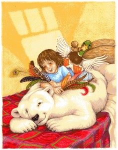
August 7 i got the news –  “I think we should go with this one.

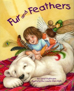
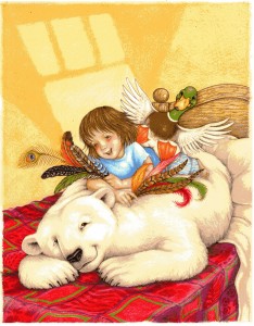
Fur & Feathers cover art

Fur & Feathers cover art

Of course that’s how it looked when i finished it, obviously i still had to color everything in.  But that – and the whole coloring process in general – will come in the next chapter.

Fur & Feathers: Chapter 6 – Pencil Roughs (cont. again), All Creatures Great & Small

Tuesday, March 16th, 2010

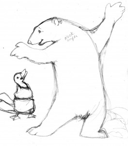
The pencil rough process is the longest (at least in terms of describing it) as evidenced by the chapter continuation of the previous chapter continuation, but let’s face it… it’s kind of a good metaphor for life, or evolution.  Each pencil scribble builds on the past,  getting more complex, fixing the parts that don’t work, tweaking the parts that have potential.  Building a character that will, eventually, become the fully realized personality in the picture.  ‘Til then there’s just a lot of scribblin’ goin’ on.  I’d have to go back and scour my journals to actually see how much time was spent on the process of creating the main animal characters, but i generally block off a space of “free time” between other projects and just hole up in the art room until such time as i’ve either finished what i wanted to accomplish, another deadline takes me away, or my head explodes.   In the case of “Fur & Feathers” (or F&F as i generally refer to it in my notes) along with the human character of Sophia i also had to create seven  featured animals: a polar bear, a duck, a porcupine, a frog, a fish, a snake, a snail and a ladybug.  The polar bear was first.

Ruff-P'Bear751

I have a special fondness for polar bears.  One of my first (well, technically my 3rd) major mural projects was painting a life-size polar bear on a wall, followed by a faux den and polar scene with life-size female p’bear and cub,  so i already came to the F&F project with a bit of Arctic bear experience.  The fun of this variation was – i could be a lot more whimsical.  I mean, the bear starts out naked after all (if you’ve been reading along the whole “naked animal” issue was discussed previously), so i could take all those natural/realistic references and mix them up a bit.

Here, i guess, is a logical place to discuss the nature of illustrator-ly “style”.  At least what i know of it.  Artists tend to have a particular “look” or “style” (or “tell”, if you’re familiar with gambling parlance) – that you just recognize when you see their work, no matter what the context.  Van Gogh from Matisse.  Rockwell from Escher.  Trina Schart Hyman from Brian Froud.  [Okay, i’ll admit i often get James Montgomery Flagg and Howard Chandler Christy confused, but that’s just me].  While i in no way mean to imply i rank with those artists, my style is what it is… my own particular way of drawing things.  I occasionally attempt different techniques but, by and large, i can’t help but gravitate back to the semi-realistic, partly-cartoony look i’ve been doing forever.  F&F, however, allowed me the opportunity to dip into something a little bit more fanciful – meaning, that however “realistic” and natural the animals in the story were going to be, i had the leeway to be a bit looser and more carefree with them.

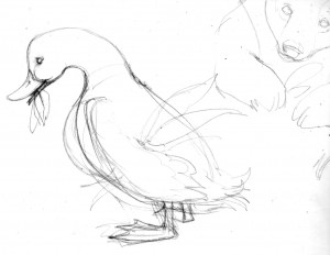
Of course i need to stress “looser” is a relative term here.  I probably couldn’t really get very “loose” with my stuff even if my life depended on it (believe me, i’ve tried).  I’ll start out all broad and free-form and next thing you know i’m hunched over again with my tried-and-true, tight-fisted approach.  The point of all that being – a different artist would have approached this story in a completely different way, not “better” just different, and it’s kind of fun to imagine how someone else might have rendered it (that would make for an interesting book all by itself come to think of it).  But i’ve gone off on a tangent again – and i still have seven more animals to introduce.  Like the duck.

Ruff-Duck752

While there is only one kind of polar bear – no matter how you choose to draw one – there are many, many, many, many different types of ducks (and i should know, because i’ve been called upon to draw a fair number of them for ID plaques) and Janet didn’t really specify what kind of duck she had in mind.  Here is where the artist gets to use that “artistic license” you’ve heard so much about.  Given the narrative i really could have picked any one of a number of species: Common Shelduck, African Pygmy Goose, Wood Duck, Northern Pintail, Pink-Eared Duck, King Eider, Harlequin Duck, Common Goldeneye, Common Merganser, or Smew.  So long as it had a white band somewhere on its neck (per the manuscript) i could have opted to use anything.  But, i felt the needs of the story were better served by going with a Mallard.  A good basic workhorse of a duck (to mix a metaphor) that the average aged reader of the story would instantly know.  An icon D-U-C-K of a duck.  There was already enough crazy stuff going on in the story – what with the naked animals and Sofia re-dressing them all – without introducing unnecessary character complications.  The porcupine, however, proved to be a bit more problematic.

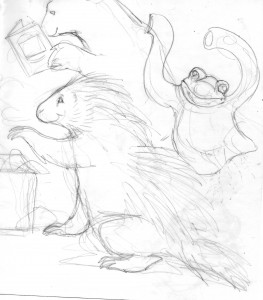
Ruff-Porcupine753

There are a couple different varieties of porcupine but choosing which one to use wasn’t the problem.  My difficulty actually came from a probably far too literal reading of the manuscript.   In the story, if i haven’t explained this yet, all the animals lose their various fur/feather coverings in a wind storm-induced dream and the little girl, Sophia, re-covers them with the ingenious and creative use of the contents from her grandmother’s sewing basket.  In the porcupine’s case, Sophia chooses pins and needles which are quite clever except – in my mind – they’re too short.  Porcupines have long quills, and lots of long coarse hair, and i really couldn’t figure out how i was going to make short little pins fill that need.  Interestingly enough, i went ahead with the pencil roughs on these pages without really having the  answer or how i would portray it.  I put a basic “generic porcupine” in as a place -holder, and postponed figuring out the actual look of this character until later so i could move on to – the frog.

Ruff-Frog&Porcupine754

As the rough sketches may demonstrate, i like putting visual clues in my children’s book illustrations.  Hinting at things to come or enhancing what has already been seen.  For F&F i wanted to show the animal first in it’s naked/dressed-in-Sophia’s-clothes guise and then show it re-dressed in it’s new animal skin, and while one animal is revealing its new covering the next animal in need of help is visible in the background.  In this case, the “newly fixed” porcupine is picking out its decorative needles (i was still struggling with that) while the next animal, the frog, hops around -hopefully humorously – in Sophia’s sweater.  I decided on a bullfrog  because it has interesting skin patterns, but also because it was different from the leopard frog i drew in my previous book (sometimes it just comes down to simply not wanting to copy yourself).

Note on the clothes:  I tried to pick clothes or  accessories that were wildly inappropriate for the animal’s life style.  As if any clothes at all weren’t inappropriate enough.

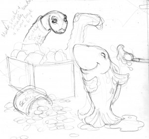
Ruff-Fish&Snake755

A fish followed the frog and just as there are hundreds of different kinds of ducks there are even more variations of fish, and while this particular fish was obviously going to be quite silly and cartoony (wandering around out of the water) i still wanted it based in some sort of reality.  In the story Sophia gives the fish new scales of rainbow sequins so i hunted through my fish books and found the perfect, colorful specimen, a Flagfish (a small, deep-bodied pupfish that can survive extreme environmental conditions.  If being scaleless and breathing out-of-water doesn’t classify as an “extreme environmental condition” i don’t know what does.  Besides, they’re pretty).

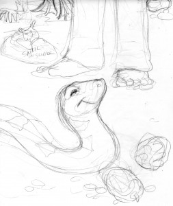
Ruff-Snake&Snail756

The next animal in need of Sophia’s help was a snake, wearing a knee sock until she could fashion new scales for him out of pine cones.  Throughout the story, Sophia gives each animal her own special personal touch – a heart behind the polar bear’s ear, a blue ribbon around the duck’s neck, a decorative hat pin for the porcupine, slime for the frog, and rainbow sequins for the fish.  In the snake’s case she added yellow bows.  From the start i chose to keep all of Sophia’s couturial creations as natural-looking as possible;  i didn’t want the snake wrapped in real ribbons, for example, i wanted the yellow “bows” to be more like markings.  So i had to find  a brown snake with a yellow pattern that looked like bows.  I also didn’t want it to be poisonous, not that anyone would necessarily know, and i eventually found my reptile in the form of an Eastern Hognose snake that has a very nice blotchy bow-esque yellow pattern running down its back and is variable in color – having a brown phase.  Also, in the rough sketch behind the snake, dressed in a slipper until Sophia could find him a new shell, is the  snail.

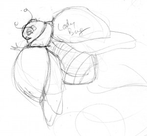
Ruff-Ladybug757

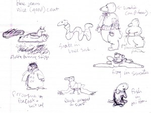
Which brings us finally to the last, featured, animal – the Ladybug who, being the tiniest character in the book, needed the biggest close-up (Mr. De Mille.  Who didn’t see that coming).  In most  cases, while i may have done a few separate study sketches of the different animals, most of their look and personality was actually established during the process of roughing out each full page of the book.  Enlarging the thumbnails up to full size helped the animal characters evolve and in several cases the picture itself changed from the original concept…   but that’s another entry.

Fur & Feathers: Chapter 5 – Pencil Roughs (cont.), Character Building

Sunday, February 14th, 2010

“Character Building”, both figurative and literal.  On one hand we have the illustrator going through their own creative mental process  (welllll… i do, not everyone is as angst-prone as i am i suspect), but also, from the art standpoint it’s a lot like Dr. Frankenstein (a bit of this, a bit of that, stitch it all together, add a lightening strike) with some Darwinian evolution thrown in.  It starts as a scribble… but it grows and evolves, and eventually winds up becoming a real, finished character.    “Fur & Feathers” had several featured characters that needed to be developed, mostly animals (something of my speciality), but also a little girl, named Sophia.

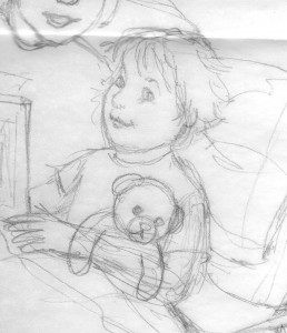
Sophia-1stbed rough707

The minute i read the story i wanted Sophia to look like my daughter.  Let’s face it, there is something of an autobiographical  streak in all creative work.   I suspect, when she wrote it, Janet Halfmann was picturing someone from her own life  – a relative perhaps, or maybe herself as a little girl. The wonderful thing about “art” – any art – is that it allows the creator (and the audience too of course) to transport themselves. To be part of the action or the experience.  The writer does it a bit more metaphorically, with words which by their very nature are more abstract and ethereal – interpretive.  The illustrator gets to give it a more concrete, tangible form .   Such is the give and take, the ebb and flow, the yin and yang, the I-have-the-pencil-and-I-know-how-to-use-it nature of the visual arts.  And it does wind up kind of excluding the author.  This came up at a book talk recently, when a writer said that she preferred to self-publish – so she could work directly with the illustrator and have a stronger say in how her story, her characters, were portrayed.  Fair point.  That is certainly a legitimate concern and all i can liken it to is when someone writes a screenplay and sells it to a movie studio.  Unless that person is going to produce and direct the movie themselves (as well as finance the dream cast, build the sets, sew the costumes, and cater lunch) they kind of have have to trust the people who do that for a living. When it comes to stories, the writer has to trust the publisher to pick the best illustrator for the project.  An illustrator whose skill, style, and  technique the publisher feels will best compliment the author’s words and bring the story to life.  Maybe even take it to places the author never considered.

In the case of “Fur & Feathers” i think Sylvan Dell went out  on a limb, just a little bit, with me because this story was something of a departure from my other books.  There were animals to be sure, but there was also a human character that had to be sustained throughout 13 full-page spreads.  And the setting was all interior, the little girl’s room, as opposed to the more natural settings i’d illustrated in the past.  Now i do draw people, and have many in my portfolio, a lot of them children, but a one-off, spot illustration is different from a sustained character in a series of drawings.  I knew i could do it (oh, okay… i thought i could do it)  and i gave Sylvan Dell several samples of my children sketches, per their request,  to demonstrate i was up for the challenge, but it was still an incredible vote of confidence and faith on their part to let me run with the story.

But all that artist ego-bolstering aside, the fact remained that in terms of “Fur & Feathers” i really wanted Sophia to look like my daughter… my quintessential Muse… but my “little girl” had long since grown up and was no longer the age of the child in the story.  In fact, all the kids in my neighborhood, who i had long turned to for children poses, had outgrown the age of the child in the story.  I had photo albums, and lots of other kid references, and of course my imagination, so for the initial first stab at the pencil sketches i just kind of “roughed” in the pose.  More of a place saving generic kid figure, to give a general idea of what the eventual finished character should be doing, per the manuscript  – but without all the features and details that would make Sophia “real”.  At this stage it really didn’t have to look specifically like my daughter, or “anyone” for that matter … it just had to give the basic idea of what the character was going to be doing in the picture.  All the pictures.  Details would come later.

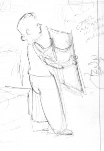
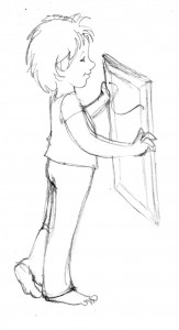
Sophia(standingrough1)704

It does help to have an actual reference.  A real person or a photo to look at.  Again, i am just speaking for myself, but i am reminded of something one of my professors said in college.  It was a painting class, and i was doing a still life of bottles and twigs, but i was making it up entirely in my head.  My professor came around, and noting the lack of real, physical items suggested i go out and actually gather the objects i was trying to paint.  He said the human mind was not nearly creative enough (and i’m paraphrasing here, because it’s been ages since the class) to recreate all the nuances and details, effects and shadows, found in nature.  In rather stereotypic cocky college-kid fashion i thought my professor was bonkers.  My imagination was more than creative enough, thank you very much… but, big surprise, my professor turned out to be right.  It really does make the job so much easier when you have good references.

Of course that being said, i need to confess i never did have a specific consistent reference model for Sophia.  She was kind of an amalgam of pictures of my daughter, other kid tear sheet references, and photos of the young girl who lived down the street (who was the right age and very happy to pose for me so i could get Sophia’s body correct).  Since i was going for a more whimsical style i felt i had a degree of leeway with Sophia’s over-all appearance, and just kept fine-tuning the pencil sketches using what references i had available to work with.  In retrospect i kind of made that part of the job harder on myself than was necessary  because i agonized and second guessed myself the entire time i was drawing Sophia – worrying she didn’t look consistent from one illustration to the next.

But even if i the perfect child model had been readily available, and at my beck and call whenever i needed a quick pose, it was still up to me to decide exactly WHAT this fictional child would look like.  Long hair or short.  Pig-tails or curls.  Black hair or brown.  Freckles?  Glasses?  So many decisions.  I did all the preliminary rough sketches giving Sophia a kind of short-ish  bob hair style (a bit mussed since she’d been sleeping) and that just became her look.  It wasn’t a particularly conscious decision beyond the fact that i didn’t want her to look too “girly” so the book could appeal to boys as well as girls.  I read somewhere that girls generally have no problem reading books with boy protagonist, but boys tend to shy away from books with girls as the leading character, so Sophia needed to be broad-based enough appeal to all readers.  And heck – it didn’t hurt that she looked a lot like my daughter did at that age (what are the odds!?).

Sophia-bed2rough708

And besides being responsible for the hair and make-up (so to speak) the illustrator also has to serve as the costume designer.  If the clothing details are not described in the manuscript it is up to the illustrator to figure out what the character needs to wear.  Obviously period stories need time period appropriate attire, modern stories – particularly those that take place predominantly in a child’s dream – give you a lot more flexibility.  Since F&F starts out with Sophia in bed, and the story continues through the rest of the night,  it was pretty obvious that pajamas would be the clothing of choice, but that still offered a broad range of options.  Night gowns, footie PJs, over-sized T-shirts, gym shorts and a tank top – all sorts of possibilities were considered and discarded.  Though actually, in the case of F&F, i didn’t consider and discard that many options.  I had a pretty clear idea of what Sophia would sleep in right from the start.  Being a current, modern, story (as opposed to a period piece) and based on what my own daughter used to wear (and what i like to lounge around in) i immediately thought of traditional pajama bottom pants and a related short-sleeved T-shirt ensemble.  I confirmed this couturial choice with my Sophia/Jesse model down the street but i must confess i was also influenced by the pajamas that the 10th Doctor wore in the “Doctor Who” episode, “The Christmas Invasion” and wanted to give a little visual nod in that direction.  That was probably one of the first, of what would wind up being several, little personal pictorial inclusions (not counting Sophia’s whole appearance to begin with) throughout the book, but those will all be explained and examined in their due course.

Sophia in her pajamas

Sophia in her pajamas

For the time being Sophia was more or less figured out.  Now it was time to turn my attention to the featured animal characters…..

Fur & Feathers: Chapter 4 – Pencil Roughs (or “Juggling w/ Pencils”)

Sunday, February 7th, 2010

I got the contract and deadline information for “Fur & Feathers” in April (2009) – the important due dates:  Sketches – July 20 (these would be the Pencil Roughs). Cover art (camera/scanner ready) – August 15.  Final art (or finished color) – December 2o.  Lots of time to get everything done… except, drawing 13 line illustrations for a children’s picture book was not the only thing on my To Do List.  It never is.  I can’t speak for other Graphic  and Commercial Artists or Illustrators but for me life often feels like a continuous three-ring circus, multi-tasking, juggling act.  Constantly working on one project while i wait for approvals on another, or paint to dry, or reference information to come in.  A client meeting here.  A design proposal there.  Rough sketches for Project A this day.  Finished art for Assignment B the next.  While thumbnail sketches were technically not a required step in the F&F illustration process as far as Sylvan Dell was concerned i had to do them anyway – for myself – before i could ever start working on the pencil roughs so those had to be factored into the schedule as well, along with all the  other art projects i already had on the calendar.  Projects with more pressing, or at least equally pressing, deadlines.

Two large posters depicting the various layers (and what lives there) of the Rainforest and the Ocean, and a five-wall mural for a local elementary school were the most immediate concerns.  I juggled thumbnail sketches with the finished color work on the posters through May and got the thumbnails mailed out on June 3rd; then i turned my attention to the details of the school murals, my first large-scale public painting project – a series of 5 walls – i was going to start painting the day after school closed for the summer on June 11.  I’d already come up with the rough sketches for the walls and figured it would take about a month (a week per wall – give or take) – of steady work – to complete, so the first week of June was filled with school meetings and preliminary drawing and reference work.  On Sunday, June 7 i suddenly had my first panic attack, realizing i had to have finished F&F rough pencil sketches in Sylvan Dell’s hands by July 20… about the time i figured i’d just be wrapping up the murals.   Talk about suddenly being in a cold sweat!

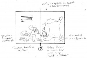
Of course after the initial hysteria i remembered i would have every Friday, Saturday and Sunday free, because the school did not want me working in the building on those days, so i reassured myself that i could paint during the week and dedicated every weekend, from June until mid-July, to the F&F pencil roughs until those were finished.  Fortunately a good portion of the “heavy lifting” had already been done through the thumbnail sketch process so that simplified things significantly (and i’ll use the drawings for Page 5 as an example of the steps, with additional descriptions supplied by my journal entries written during that period).

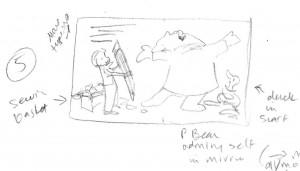
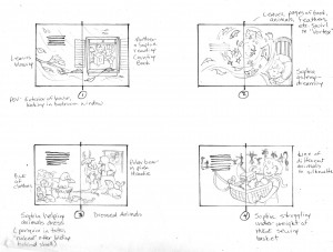
F&F-1st rough thumbnail698

The illustration where Sophia “re-furs” the polar bear was one of those that didn’t change significantly from 1st rough thumbnail to finished color.  I hit on the bear’s “Ta Da” pose, with Sophia holding a mirror, almost instantly and never wavered (they don’t all come that easily).

F&F-finished thumbnail699

With the exception of repositioning the duck this illustration didn’t change much.  I still wasn’t entirely sure how i would portray the newly furred p’bear (would it be more of a hand-made garment, like a coat?, or regular fur) nor did i have a clear idea of what Sophia would look like yet, but the basic images were established.  Per my journal entry:

SUNDAY, JUNE 21 – “Worked on F&F roughs and run to B&N for a book. Today i start roughing the Fur & Feathers rough sketches up to size.  This is just the first, initial pass and won’t require a lot of thought or detail, so it should be an easy project for today.”

Calendar Juggling Note – The J A Crookhank Elementary School murals began on Thursday, June 11.  The weekend of the 13th – 14th was spent finishing up the Rainforest & Ocean poster art.  Rest of the week was spent painting.
SUNDAY, JUNE 28 –  “Took a few notes for the book.”  That’s the only note written concerning F&F but i know what it means – reference hunting.  I do a lot of reference hunting (which i shall describe in more – excruciating – detail in another entry).

Calendar Juggling Note – Continued daily mural painting during the week (finish wall #3, start on wall #4).

FRIDAY, JULY 3 – “...more work on F&F – looking up animal and kid pose references.  Started cleaning up the first rough illustrations.”

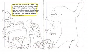
F&F- 1st pencil rough700

At this stage i mark out the full size book and indicate the “live area” as well as the word placement (supplied by Sylvan Del).  I always have leeway to change where the type falls, but i generally just work within the limits Sylvan Dell has set.  This is the stage where i really get to see if my thumbnail sketches fit the format.  It’s also frequently the stage where i suffer my first, of potentially several, self-doubt and confidence issues.

SATURDAY, JULY 4 – “Worked on book.  Well, i put in a full day of work on the F&F roughs and true to my usual form i feel half teary, slightly frustrated, a bit overwhelmed, and basically dissatisfied.  In other words – the way i always feel at the start of a big project!  I’m still just doing the roughs (in this case, the next phase of cleaning up the enlarged rough sketches and fine-tuning the layout and design) but there are simply so many elements i feel a bit inundated.  Not only do i have to figure out the over-all best look of the page, i have to figure out the look of ALL the major characters – one of them being a little girl.  Of course i want it to be Jesse, but at this point i’ll just be happy with consistent.”

Part of the problem, i realized, was i needed better references poses, specifically for the little girl, to achieve stronger image placement and visual interest.  The first round of sketches were kind of static and basic, just to block out the characters, but now i needed to start adding detail (like facial features, Sophia’s hair, her pajamas, etc) and more interesting positions.  In the past i had an easy, instant child model in the form of my daughter (my Creative Muse and Partner in Crime) but she had long since grown up, not to mention was away at college, so i was kind of winging things using old pictures from the photo albums (of which there are currently 44).  I was also simultaneously trying to establish the look of the main animal characters and their poses.  And don’t even get me started on the background issues (backgrounds are not my strong suit, so are basically ignored for as long as physically possible).

I kept trying to remind myself that these were just the preliminary sketches and i didn’t even necessarily have to have EVERY design and character question nailed down by the deadline, but i also still had to finish the 4th school wall mural and start the 5th one (which, i should note, i had not quite yet finished designing).  As so often happens with my “I have a bad feeling about this” anxieties however – and a recurring theme as you’ll come to find – i might have over-reacted just a teensy-weensy wee little bit.  Because…

SUNDAY, JULY 5 – “... i went back to the F&F roughs and actually had better luck.  I’m still far from solving all the issues, but i’m a little happier with the over-all look.  Still have no clear idea about what to do with the background, and a couple of the illustrations need some major rethinking, but over-all i feel a bit better.

Calendar Juggling Note – Finished wall #4 on the 8th and came up with a great idea for the 5th – and LAST wall!  Also this week – went to Orlando to paint a life-size leatherback sea turtle statue.

SATURDAY, JULY 11 – “...managed to fix the one illustration layout i wasn’t entirely happy with and got the line of animal shapes roughed in for another page.  Also – ran into R. S. [the daughter of a friend] and asked if she’d do some kid reference poses.

Calendar Juggling Note –  The Crookshank murals were finished on Monday, July 13, with a protective sealant applied  the next day.  Another run to Orlando to work on the sea turtle statue and a day spent on a rush art  assignment that came in.  Oh, and the final “Fur & Feathers” pencil roughs were mailed this week as well!

Fur & Feathers: Chapter 3 – How Do I Make Naked Animals Cute?

Saturday, January 23rd, 2010

The beauty of words and drawing is – anything is possible.  You are not constrained by the Laws of Nature or the Rules of Reality.  You aren’t really constrained by much of anything except, perhaps, the limits of your own imagination (and possibly skill sets)… but even then there’s no hard and fast boundaries.  You can have characters do or be anything  without fear of anyone saying “But that’s not possible”.  Nonetheless, there are certain conventions unique to specific genres that one tends to try to follow –  making the subject look reasonably natural and realistic if that is what the story entails or the publisher requires, for example.  “Fur & Feathers”, however, was not one of those kinds of stories so i was free to let my imagination run as wild as i liked, and i could loosen up a bit on the heretofore (isn’t that a great word, by the way, not used nearly enough.  Ranks up there with notwithstanding as an all-time great singular word made up of a bunch of smaller individual words all mashed together) more naturalistic style i’d been using for my previous children’s books (“If A Dolphin Were A Fish”, “Little Skink’s Tail” and “Where Should Turtle Be?”).

I’m not really sure how to characterize my actual style.  It’s kind of a blend of cartoony and realistic, strongly influenced by years of watching Disney animated films and my deep passion for children’s books and their illustrators.  For the previous books i gravitated more to the “realistic” end of my personal style spectrum (well, assuming you can call a dolphin-pelican morphed hybrid “realistic”) because that was what the stories required, but for “Fur & Feathers” i was able to explore the more playful, fanciful side of my repertoire.  It all takes place in a kind of dream place – so reality was not that crucial.  That’s not to say that made the job any easier however.  Right off the bat, in fact, i faced a difficult artistic problem, one i circled for days as i read the manuscript and jotted down notes.  Specifically – fanciful or not – how to make naked animals look cute!

I guess i’d better give a little story synopsis, huh?  Okay – the book opens with a wind storm raging outside a little girl’s bedroom.   The howling wind wakes Sophia (our heroine) and her mother suggests they count animals until she can fall back to sleep.  In her dreams, however, the animals get all swooshed up in the wind storm, spinning faster and faster until “the wind blows them right out of their coats” and they are left standing in Sophia’s room shivering “in their bare skin“.

Sounds cute, doesn’t it?  The operative word here being sounds.  Now picture the reality…  take your time i’ll wait.  Do images of naked mole rats, plucked chickens, Chinese crested dogs, and those weird cats without hair come to mind?  Do any of those things actually look cute?  (well, obviously to some folks they do, and no offense to naked mole rat lovers and Chinese crested dog and hairless cat fanciers intended).  Heck, even sheared sheep and shaved alpacas look a little… peculiar (and not necessarily in a fun way, tho i suppose the argument a could be made that they are at least funny looking).  Anyway, now try and figure out how to draw that – for a children’s book – without creeping the reader out.  Not to mention there is a whole other problem you probably have never thought of (having little opportunity to imagine naked fauna) –  without distinctive markings, color patterns, fur, hair, or feathers a number of animals don’t really look like much.  Or at the very least they all look surprisingly alike.  Think about it: line up a jaguar, a leopard and a tiger and strip off all of their fur, now you have three large cats that could all be pumas or panthers or  lions (sans mane).  The point is – without fur, feathers, distinctive coloration, markings or patterns you don’t have a lot to work with by way of distinguishing one animal from another, and all birds simply wind up looking like varying sizes of frozen poultry (and i don’t care who you are – plucked birds have got to be the ugliest things on the planet.  Well… besides hag fish).

The whole story is about Sophia attempting to clothe all these naked animals, first with outfits from her own closet and then later by fashioning their real coverings, or a reasonable facsimile, (thus the Fur and Feathers of the title) from things found in her grandmothers sewing box.  It’s all really very clever how she does it but this is where words have a bit of an edge over the visual arts in that words don’t have to show you how it’s done or what these poor exposed creatures look like in the interim.  That task fell to me.  So the first order of business was figuring out how to convey nude creatures in a fun, uncreepy way, and also have the young child reader/listener be able to figure out what the different animals were without benefit of their normal distinguishing characteristic externals.

I was pretty safe for the first two pages because the opening illustration shows Sophia and her mom in Sophia’s room – so there were no animals, naked or otherwise, to contend with.  And the second page was the wind/animal/dream vortex so i could just show bits and pieces of various animals all still mostly covered in their regular fur/feathers or hidden by storm debris.  It was after page 2 that the difficulty (and the fun challenge i hasten to add) began because that was when all these bare animals showed up and Sophia’s adventures started in earnest, beginning with pulling all her clothes out to cover them.  It was the clothes that finally solved my problem.  By putting the animals in various human outfits i eliminated the need to show any of them completely naked.

The Featured Naked Animals In Children's Clothes

The Featured Naked Animals In Children's Clothes

Eight specific animals are featured in the story, and these guys would be in “costume” until covered by their new “natural” Sophia-made dressing of fur or feathers or scales or slime thus no longer posing an esthetic problem.  For me.  I’ll happily concede i probably spent way more time worry about that detail then was absolutely necessary – but such is my process.  Obsessive is another description that comes to mind.  As does Compulsive. Or  Anal.  I’ll cop to them all.  And my overly-analytical micro-management  concerns about making naked animals look appealing (and identifiable) did not completely end with the addition of clothing.  I was faced with one more dilemma – what to do about the Polar Bear?

A polar bear is the very first animal Sophia “fixes” (for lack of a better word) and here is where the realistic side of my art style came into play, as well as 11 years working for SeaWorld – one major project being a back stage mural of a polar bear habitat.  My SeaWorld stuff, by it’s nature, has to be more realistic and i take a lot of pride in researching whatever i’m called upon to paint, sketch or draw so that it is correct.  And one of the biggest things i learned during my polar bear mural experience is – Polar Bears have black skin! (NOTE: another little FYI tid-bit: their fur is technically clear.  Think of it like a sheet of plastic wrap – it’s transparent until you ball it up, then it become opaque, and looks white.  That’s how P Bear fur works – the fur is actually transparent so the Sun’s rays can penetrate to the black skin beneath – thus keeping the bear warm.  Pretty cool, huh?  No pun intended).

So now i was faced with a naked polar bear that would technically be black with all it’s fur removed, so that it now looks like a black bear (at least as far as a children’s illustration is concerned.  Obviously, in real life, a polar bear looks nothing like a black bear – they have completely different body shapes), which i feared would confuse both a child and an adult reader.  Of course nothing in the manuscript said i had to show the polar bear prior to receiving his new coat (and why Sophia’s grandmother has fur in her sewing basket will be discussed in a future installment) but i like the continuity of linking story elements together, and giving little visual hints and clues of what is to come in the illustrations, so i really felt it was important to show the p bear going thru the entire make-over process.  Again it was the clothing that came to my rescue and if you look at the upper right corner of the thumbnail sketch above (or the pencil rough below) you’ll see how i solved the problem.  I put the p bear in a hoodie and then simply covered as much of him up as i could.

Rough Thumbnail for Page 3 - Sophia Dressing the Animals

Rough Thumbnail for Page 3 - Sophia Dressing the Animals

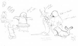
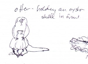
With that problem solved, and an idea of how i would handle the other featured animals as they each appeared in the story, i was able to start brainstorming the actual rough sketches.  Page 3 is where Sophia dresses the animals in her clothes and i wanted to show a variety of animals in a number of very silly and inappropriate (for an animal anyway) outfits.  The polar bear was the only “featured” animal i wanted on the page so i had to come up with some new ones.  Which, as i explained earlier, isn’t as simple as it sounds because these animals had to be easy to identify without their usual markings (when done in color they’d all be grey or pink after all, or black in the p bear’s case) as well as partially covered up with clothing.  A sea lion, deer (later changed to a big horn sheep), komodo dragon (because there is a display of them near-by at the St. Augustine Alligator Farm), and penguin fit the bill perfectly.  And then i thought of the sea otter…

Naked Sea Otter w/ Clam Shell

Naked Sea Otter w/ Clam Shell

… my personal favorite i must admit.  Proving, i suppose, that naked animals really CAN be cute after all!

Now it was time to start doing the rough sketches (aka:  To be continued…..).

Fur & Feathers: Behind the Book – Chapter 2, It Starts With the Manuscript

Friday, January 8th, 2010

Well, technically, i guess it really starts with the publisher contacting you to see if you’d like to illustrate another book… then after much clamor and excitement and  jumping up and down and e-mailing back “YES!”  in big bold letters you sit back and wait for the manuscript to be forwarded.  For me this all happened in the Spring of 2009 (April 2 to be exact) when i got the initial e-mail asking if i’d be interested in illustrating “Fur and Feathers” and noting all the business and deadline particulars, but i must admit i was chewing my nails for those first couple months of the year waiting to hear if i’d have a new title to do.

I can’t speak for all artists but i am very insecure when it comes to work and always fear every finished project will be my last.  “Where Should Turtle Be?” had just come out mid-February or so, and Sylvan Dell was busy getting their other Spring titles on the shelves, so i didn’t want to nag them about whether they had a new book for me to illustrate – but i was eager to start on a new illustration project.  I attempted to be calm and philosophical while i waited, figuring if SD didn’t have anything for me this time around i could take the lull and work on one of my own personal book projects (i have notebooks full of plot ideas and character descriptions and snippets of dialogue, so have plenty to keep me busy if  i could ever get serious about finishing something) but then i got the notice about the new book so immediately put all my own things back on the shelf.  I’m not giving up on writing and illustrating one of my own stories one day, but i’m content to wait until the Creative Writing Muse can give me her full attention.  And basically, i just work better when i have a firm deadline (otherwise i tend to be like Dug, the dog in “Up”, easily distracted by…. “Squirrel!“).

So… where was i?  Oh yes, The Manuscript.  “Fur and Feathers” was written by the very talented Janet Halfmann, author of many children’s books as well as my 2nd children’s book for Sylvan Dell, “Little Skink’s Tail”.  “Skink” was a fun book to illustrate, and seems to go over particularly well at school talks, so i was excited about working with Janet again.  Tho i think i should clarify what i mean by work with her.   I actually don’t work with her directly at all, all my correspondence and art direction comes from Sylvan Dell.  I don’t know how other publishers work, but i suspect it is all pretty similar – an author writes a story and submits it and then waits until, several months down the road, they finally get to see what a complete stranger did with their words.   I suspect it can be a little scary.  It would be fascinating to get Janet’s perspective on the process because i really don’t know what it must be like to write something and send it off and not see the story that you slaved over again until someone else has visually interpreted it.  Obviously there needs to be a great deal of trust between the author and her publisher, and the publisher and their artists, and i can assure Janet (and any/all authors whose books i’ve had the pleasure and privilege to illustrate)  i treat every one with the utmost respect and care.  And F&F was a particularly fun and challenging story to work on.

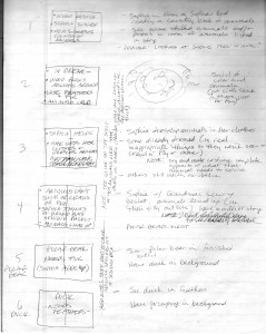
The manuscript was e-mailed, with the story already separated by page (what words were to go where), and being a children’s picture book that meant every full-page spread counted as one illustration so the drawings had to fit the action described.  I always approach every book (and most other art projects) the same way – just sitting back and reading the story and jotting notes on a legal pad.

The first pass - jotting down thoughts

The first pass - jotting down thoughts

Often it’s all just written notes and impressions.  The box on the left represents the full-page spread with the key elements of the narrative written inside.  Off to the right i make illustration notes.  Most of the time, at this stage, i don’t actually draw anything, but some times a visual image will immediately come to mind (like the swirly vortex on page 2) and i’ll sketch it in (particularly if it’s too hard to explain verbally).

After that i tend to go off on a reference hunt – any excuse to go to all my favorite bookstores to get books on the various characters, actions or settings of the story.  In this case, several different animals were going to be hi-lighted (a polar bear, a duck, a porcupine, a frog, a fish, a snake, a snail, and a ladybug) not to mention the story centered around a little girl, with all the action taking place in her bedroom, so i had a great time looking for books on everything from animals to girl’s clothes to bedroom design.  I have walls of bookshelves so already have a pretty vast source of references but one can never have too many books!

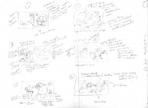
The next step is taking my written notes and roughing out the proposed illustrations in a series of small thumbnail sketches (NOTE:  I don’t expect you to actually see these very clearly, this is more to simply give the idea of the steps involved).

First rough thumbnail ideas

First rough thumbnail ideas

As the name suggests – these sketches are real small, only a couple inches wide – so i obviously don’t worry too much about detail or perspective or even where the words are going to go during this phase, this is just a way to start roughing in the layout.  It’s probably one of the hardest steps in the process because i’m staring at a blank page and trying to fill it.  I much prefer the next stages –  when i can start fine-tuning the sketches.

Cleaning up the thumbnail roughs

Cleaning up the thumbnail roughs

It may not look significantly different from the first batch of thumbnail sketches, but at this stage i start figuring out where the type is going to go and what my “live” area will be.  I really enjoy the editing process – whether it’s drawing or writing – and this is when i get to fine-tune the details.  Then it’s on to the last stage of the thumbnail process.

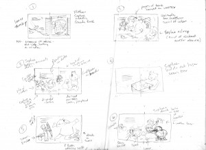
Finished thumbnail sketches

Finished thumbnail sketches

It’s all still rough, and each sketch still only a couple inches wide, but it’s enough to get the basic idea of what each full-page spread of the book will look like.  I suppose another term for it could be “storyboard”.  It’s the last step before i enlarge the rough sketches up to book size so i like to send these finished thumbnails to the publisher’s Art Director and Editor for their input.  It is not an official contractual deadline (which usually consists of:  Rough Sketches, Finished Cover Art, and Final Color Art) but i feel more comfortable having them see the direction i intend to go, just in case they have some concerns or alternative suggestions.

If they like the thumbnails… then it’s on to the Pencil Roughs.

The “Fur & Feathers” Illustrations Have Left the Art Room

Wednesday, December 30th, 2009

This story begins in the middle – with the shipping of the 13 color illustrations and cover art for my 4th children’s book for Sylvan Dell Publishing, “Fur and Feathers“, by Janet Halfmann (author of “Little Skink’s Tail“, our first collaboration).  I just got word that all the drawings arrived at their destination safely  so i can breathe a sigh of relief and now my job is largely done, at least until the book itself is printed and bound and i can start officially sharing it (at book signings and school talks and various conferences).  I say we are in the middle of the story because the whole thing began earlier this year (around March/April 2009) and won’t come to it’s ultimate (hopefully successful) conclusion until nearly the end of the next one (Fall/Winter 2010).  It’s really a lengthy process getting words and pictures into finished book form – and kind of a fascinating one, at least from my perspective – so i thought it might be interesting to chronicle the whole affair from beginning to end.

Unlike my first two protracted blog entries, however, i shall attempt to keep the “Fur & Feathers” account a bit more concise.  I love this ability to write and describe and share the creative thought process but i realize i do have a weakness for verbosity.  I also know if i make the entries too long no one will read them (or they will doze off in the middle or worse, start skimming).  I know i certainly tend to skip articles that look too long, and completely avoid recipes of too many ingredients and instructions.  However, despite being aware of my long-winded tendencies i’m not going to promise brevity… only that i’ll try to keep these particular entries contained in smaller, easier to read, segments.

So we shall call this first account (in the “Fur & Feathers Category”)  the “F&F Intro”, even tho it takes place 10 months after the actual beginning of events.  And to further the out-of-kilter continuity the attached cover illustration doesn’t technically enter the narrative until 5 months later, but i thought we needed a visual image to start the tale  (and it does – eventually – become the approved cover design, so i’m giving a bit of a preview to up-coming events in the hopes of pricking your interest).  Welcome to “The Fur & Feathers Journey”….. or….

Fur & Feathers: How It Becomes A Book

Fur & Feathers: How It Becomes A Book